︎I’m a Latvian-born Amsterdam-based independent graphic designer and illustrator. Over the last twelve years I have worked for a number of brand design agencies in London, Auckland, Melbourne and Singapore. You can scroll down through some of the examples of my work here and get in touch for any enquiries.
For my illustration work, please go to sashabutenko.com
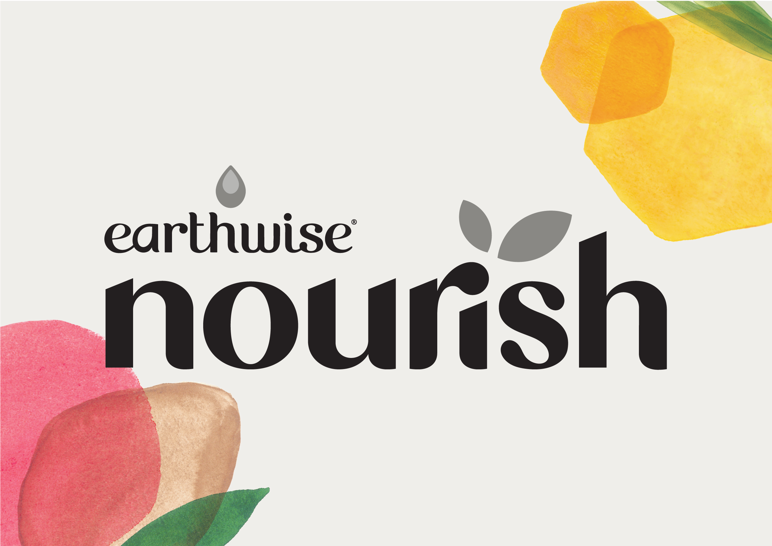
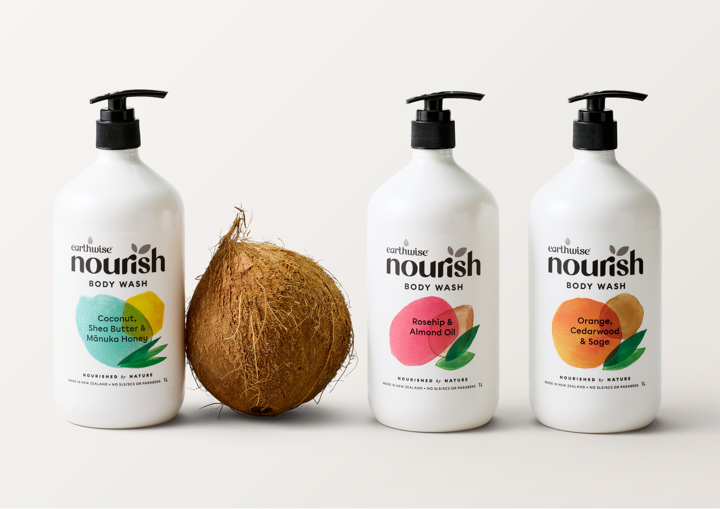
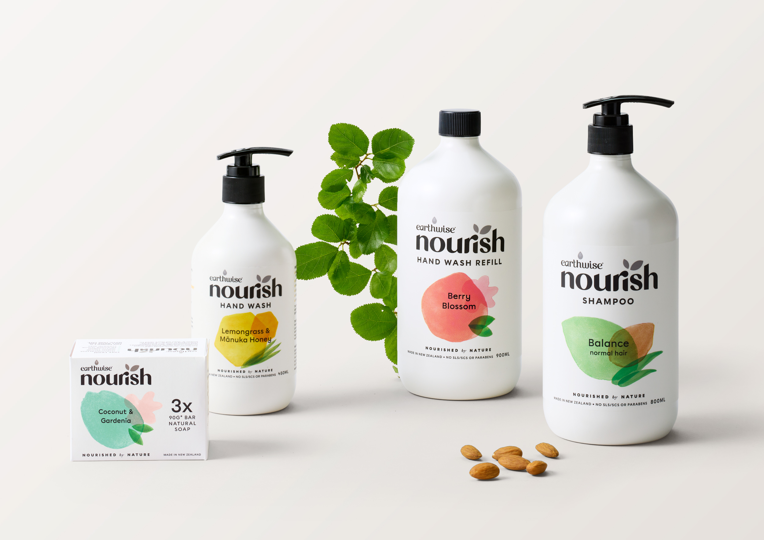
Nourish
Branding, Packaging
Creative Direction, Design & Lettering


︎ Client: Earthwise
︎ Agency: Unified Brands
︎ Client Service & Strategy: Mike Robertson, Nicole McClure, Zelda Senekal
︎ Design Director: Melissa Doria, Ann Davenport
︎ Creative Artworker: Emma Lawrence
︎ Final Art: Will Wright
︎ Illustration: Ann Davenport
︎ Case Study Photography: Melissa Doria Yuki Sato
In a category experiencing growth, Earthwise was seeing a double-digit decline in Nourish, its natural personal care offering.
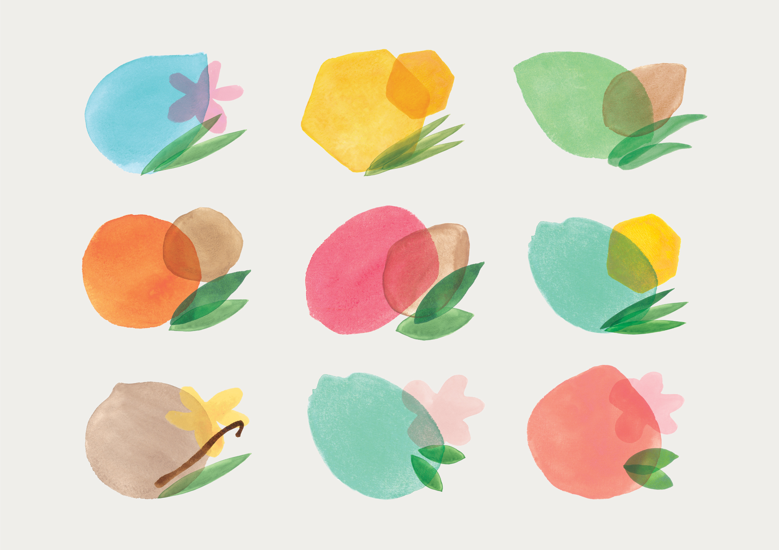
Together with the Unified team, we wanted to lean into the naturalness of Nourish’s formulations and celebrate the beauty of nature without taking the more obvious and often photographic style of actual ingredients, seen across most mainstream brands. Using abstract, organic shapes to reflect ingredients and scents, we were able to achieve a clean and sophisticated design that still felt gentle. These illustrated shapes, crafted beautifully by our Deisgn Director Ann Davenport, created a strong navigation system across the range, which had previously been lacking.
The wordmark has been has been completely redrawn to feel less clinical, as well as bring closer alignment to Earthwise.
︎ Agency: Unified Brands
︎ Client Service & Strategy: Mike Robertson, Nicole McClure, Zelda Senekal
︎ Design Director: Melissa Doria, Ann Davenport
︎ Creative Artworker: Emma Lawrence
︎ Final Art: Will Wright
︎ Illustration: Ann Davenport
︎ Case Study Photography: Melissa Doria Yuki Sato
In a category experiencing growth, Earthwise was seeing a double-digit decline in Nourish, its natural personal care offering.
Together with the Unified team, we wanted to lean into the naturalness of Nourish’s formulations and celebrate the beauty of nature without taking the more obvious and often photographic style of actual ingredients, seen across most mainstream brands. Using abstract, organic shapes to reflect ingredients and scents, we were able to achieve a clean and sophisticated design that still felt gentle. These illustrated shapes, crafted beautifully by our Deisgn Director Ann Davenport, created a strong navigation system across the range, which had previously been lacking.
The wordmark has been has been completely redrawn to feel less clinical, as well as bring closer alignment to Earthwise.
Golden Sun
Branding, Packaging
Creative Direction & Design

︎ Client: Acton
︎ Agency: Unified Brands
︎ Client Service & Strategy: Mike Robertson, Zelda Senekal, Nicole McClure, Paige Flemming
︎ Creative Team: Alisha Kay, Chiara Ronchi, Jamie Turnbull, Emma Lawrence
︎ Case Study Photography: Alisha Kay, Ann Davenport, Yuki Sato
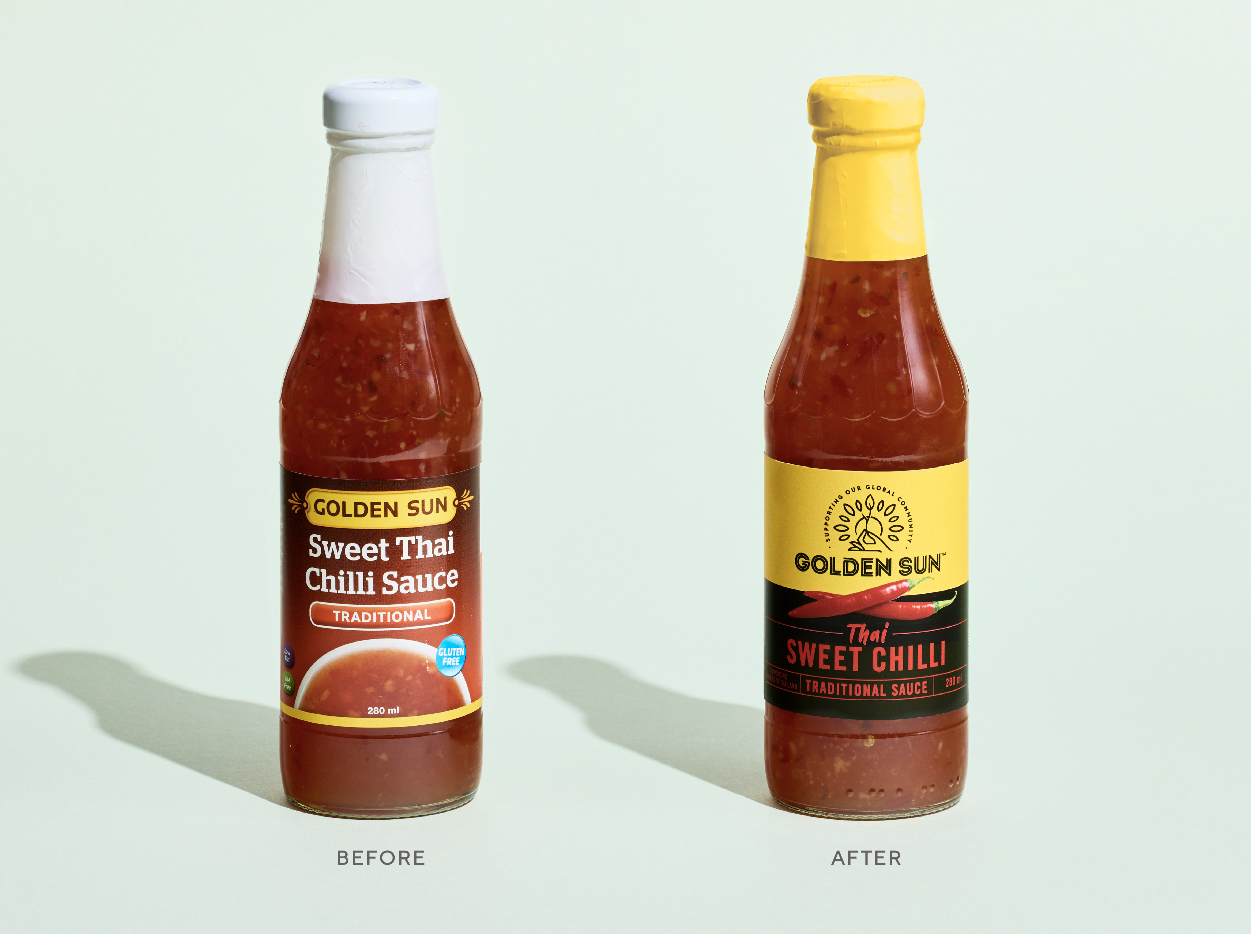
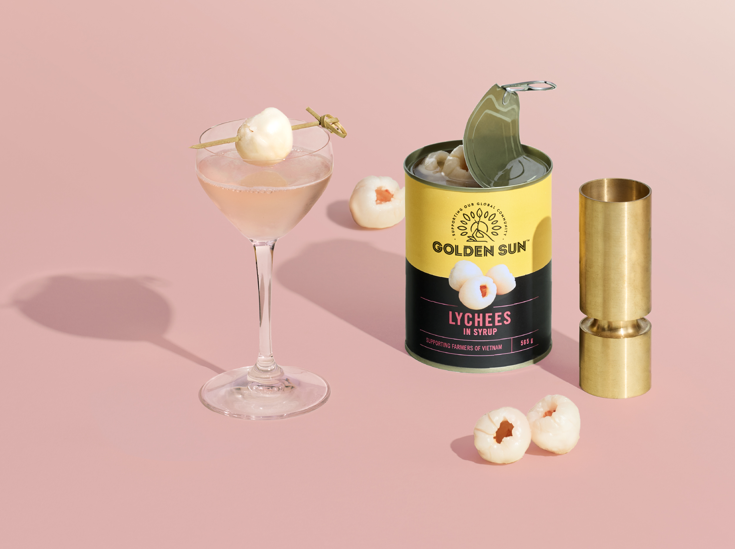
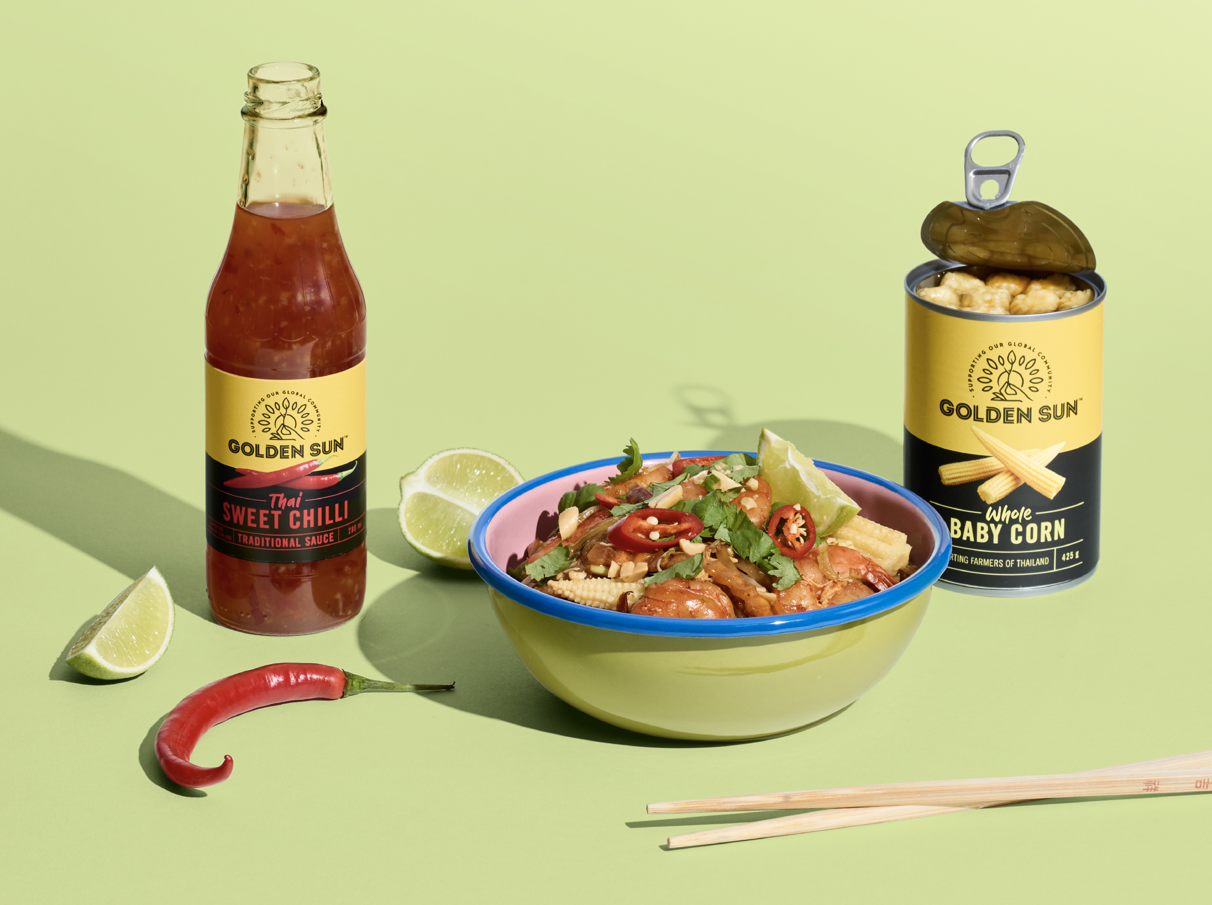
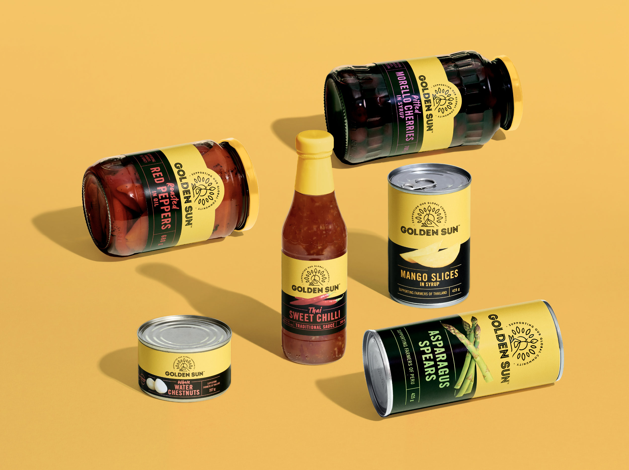
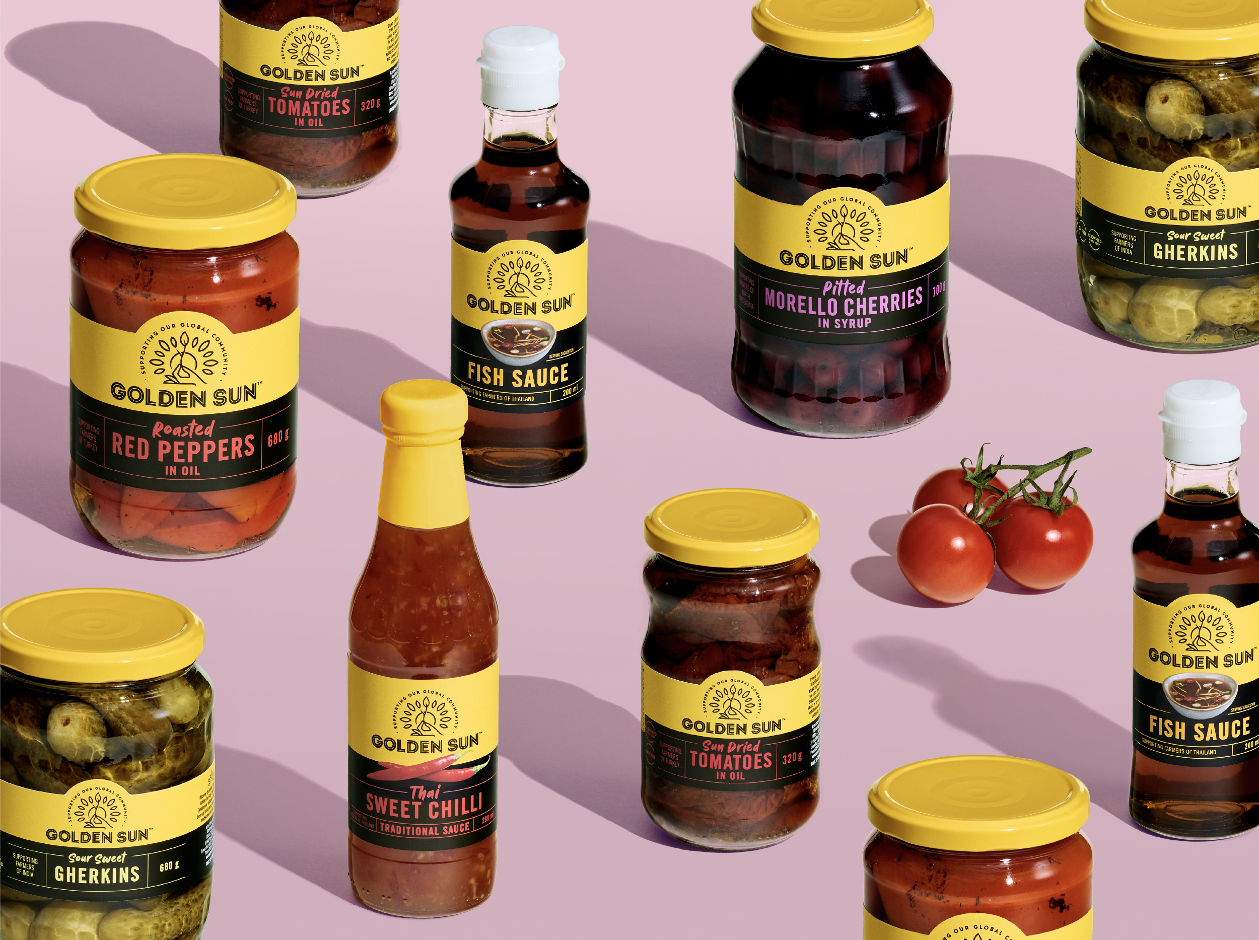
Golden Sun is a brand that was born from a desire for travel and more adventurous eating in a time when meat and three boiled vegetables was the order of the day. The original founder, Ray Thomas, searched the world for the new and exciting. He became one of the first to introduce soy sauce to the New Zealand palate, which Kiwis are eternally grateful for.
The brand was in decline and was fragmented across a sea of categories. Now run by the second generation, the family wanted to invigorate the brand for a bright future.
Unified Brands team delved into the brand's history to create a platform that celebrated the founder's passion for travel and adventure. This was married with the second generation passion for sustainability and modern global cooking trends. The proposition 'Global Cuisine with Integrity' was born. My job as a Creative Director was to bring this proposition to life and oversee its development to the very final stages of the project.
The new logo captured the idea of nurturing communities while retaining the sun that sat in the name. Simplified colour palette created an opportunity to really own the golden yellow sunshine colour and make a bolder statement both on and off shelf.
We moved the brand away from the stereotypical and dated 'Asian' design cues, which allowed the brand to talk to their wider global portfolio and expand into exciting new products. The result was a shift to a more contemporary look and feel in the category that’s filled with traditional provenance.
︎ Agency: Unified Brands
︎ Client Service & Strategy: Mike Robertson, Zelda Senekal, Nicole McClure, Paige Flemming
︎ Creative Team: Alisha Kay, Chiara Ronchi, Jamie Turnbull, Emma Lawrence
︎ Case Study Photography: Alisha Kay, Ann Davenport, Yuki Sato
Golden Sun is a brand that was born from a desire for travel and more adventurous eating in a time when meat and three boiled vegetables was the order of the day. The original founder, Ray Thomas, searched the world for the new and exciting. He became one of the first to introduce soy sauce to the New Zealand palate, which Kiwis are eternally grateful for.
The brand was in decline and was fragmented across a sea of categories. Now run by the second generation, the family wanted to invigorate the brand for a bright future.
Unified Brands team delved into the brand's history to create a platform that celebrated the founder's passion for travel and adventure. This was married with the second generation passion for sustainability and modern global cooking trends. The proposition 'Global Cuisine with Integrity' was born. My job as a Creative Director was to bring this proposition to life and oversee its development to the very final stages of the project.
The new logo captured the idea of nurturing communities while retaining the sun that sat in the name. Simplified colour palette created an opportunity to really own the golden yellow sunshine colour and make a bolder statement both on and off shelf.
We moved the brand away from the stereotypical and dated 'Asian' design cues, which allowed the brand to talk to their wider global portfolio and expand into exciting new products. The result was a shift to a more contemporary look and feel in the category that’s filled with traditional provenance.
Wattie’s
Branding, Packaging
Creative Direction & Design
︎ Client: Kraft Heinz
︎ Agency: Unified Brands
︎ Client Service & Strategy: Mike Robertson, Zelda Senekal
︎ Creative Team: Chiara Ronchi, Chris Redditt, Emma Lawrence
︎ Case Study Photography: Shadowlands, Kayla Jurlina
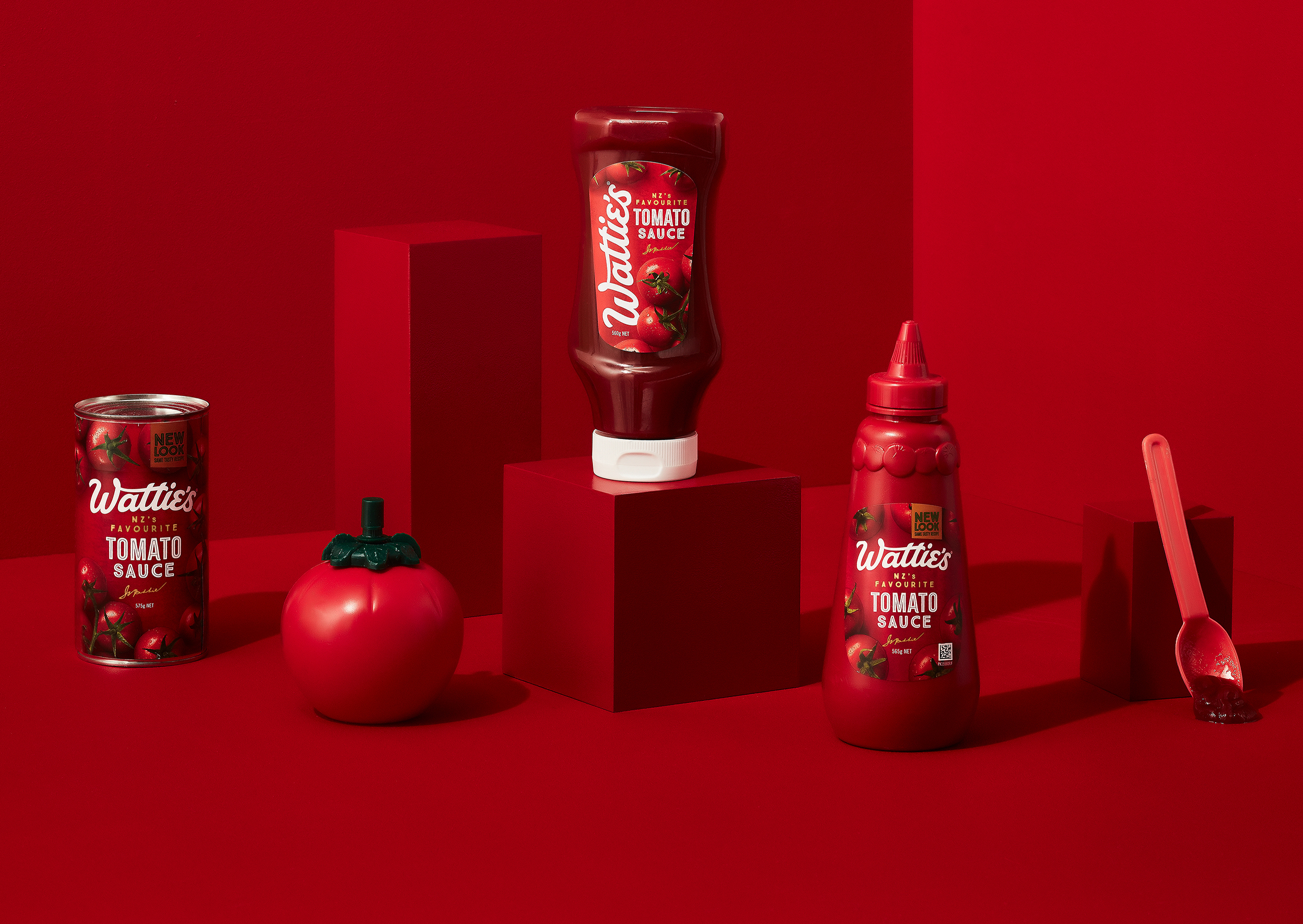
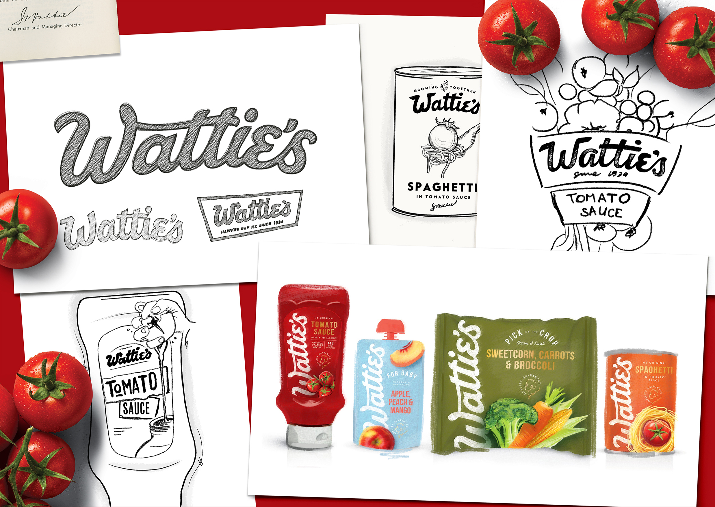
For 80 years Wattie’s had been bringing generations of Kiwis together to share and enjoy great food, however while the brand had always been held dearly by New Zealanders, it was starting to lose its relevance, hence Wattie’s came to Unified Brands for a big scale rebrand.
As the first project that I led as a Creative Director at Unified Brands, taking on such an iconic Kiwi band was a huge task that was both scary and extremely exciting.
It was no secret that Wattie’s had always been a family brand, but over time the entrepreneurial spirit of its founder, Sir James Watties, had been overlooked. To reinvigorate the brand, we set to treat Wattie’s as the dynamic, adventurous entrepreneur that Sir James had been.
We injected the life back into the wordmark by playing on the quirky personality of typographic accents that are so iconically Wattie’s, weaving a more natural flow and craft into it along the way. I like to describe it as finding the perfect meeting point between heritage and modernity – comfortable but intriguing!
Controversially, we have even turned the brand on its head, quite literally, introducing a vertical logo in Wattie’s portfolio - simple, bold and proud, almost as if signed by Sir J. Wattie’s himself.
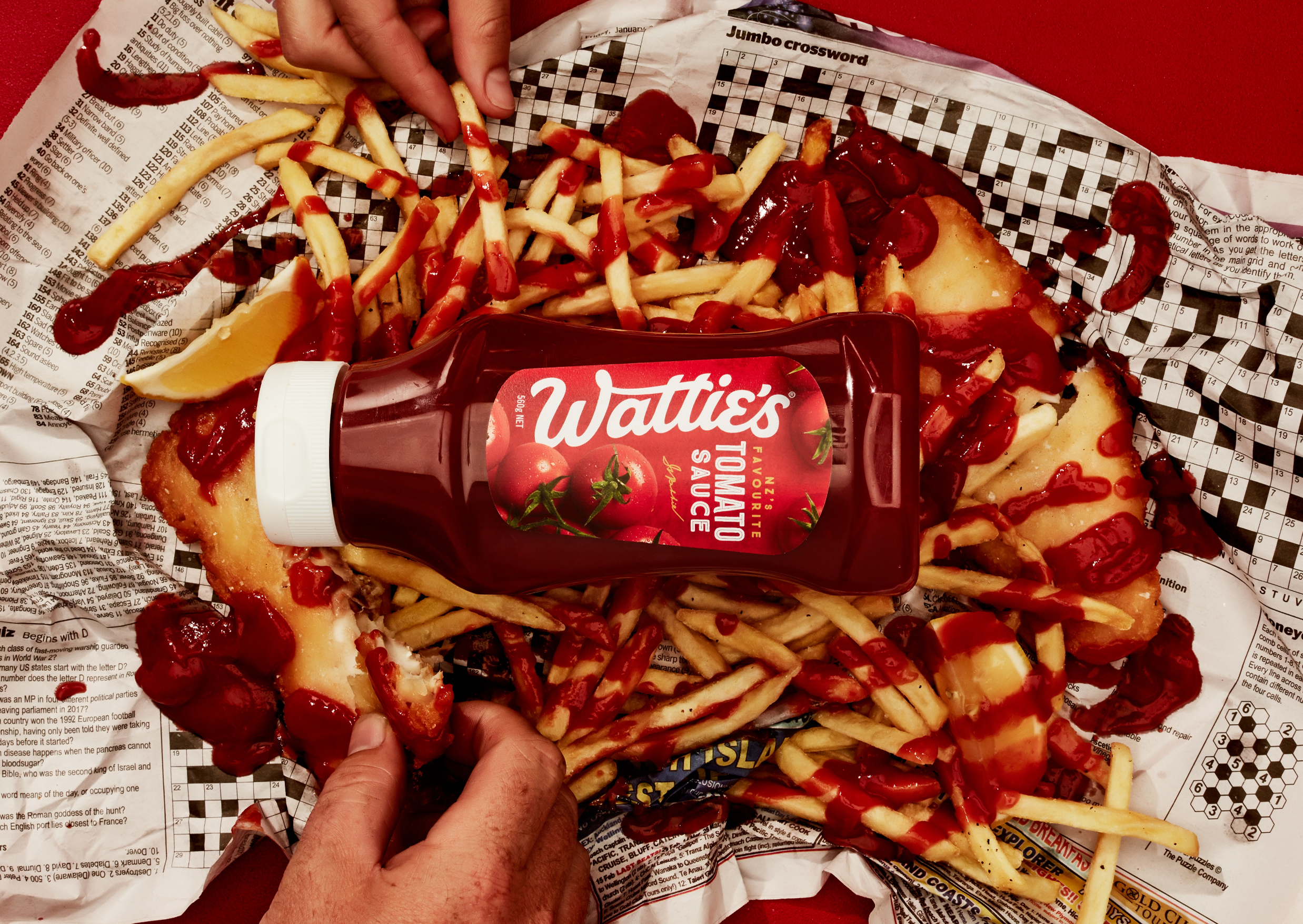
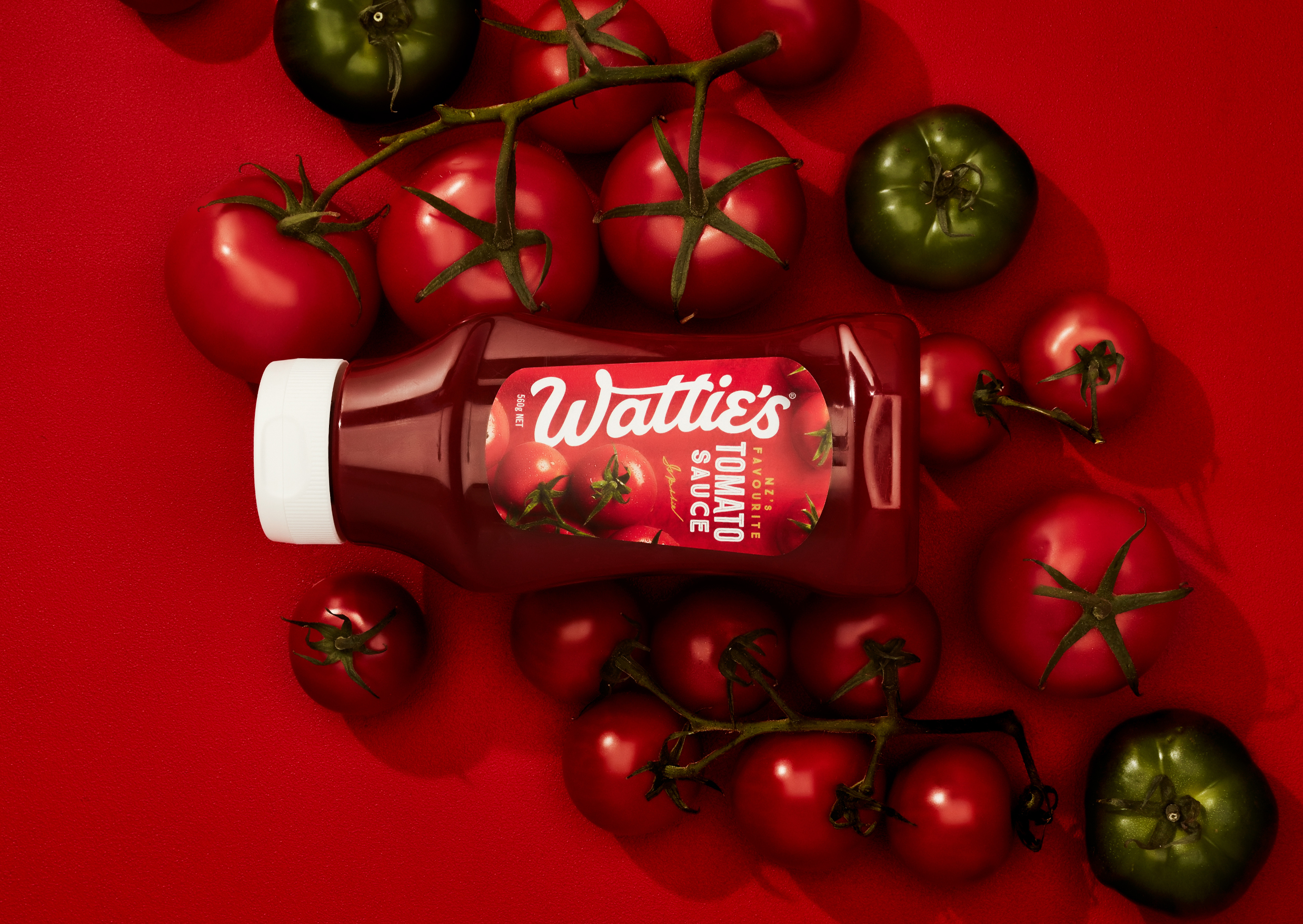
Wattie’s Tomato Sauce, one of the most iconic New Zealand family pantry staples, was the first range we redesigned. Our new unapologetically big and bold wordmark swept through the entire pack, creating a base for dramatic overhead shots of delicious tomatoes.
With the launch of Tomato Sauce range and reveal of the brand’s new look, we paved the way for to reinvigorate their entire brand visual language.
︎ Agency: Unified Brands
︎ Client Service & Strategy: Mike Robertson, Zelda Senekal
︎ Creative Team: Chiara Ronchi, Chris Redditt, Emma Lawrence
︎ Case Study Photography: Shadowlands, Kayla Jurlina
For 80 years Wattie’s had been bringing generations of Kiwis together to share and enjoy great food, however while the brand had always been held dearly by New Zealanders, it was starting to lose its relevance, hence Wattie’s came to Unified Brands for a big scale rebrand.
As the first project that I led as a Creative Director at Unified Brands, taking on such an iconic Kiwi band was a huge task that was both scary and extremely exciting.
It was no secret that Wattie’s had always been a family brand, but over time the entrepreneurial spirit of its founder, Sir James Watties, had been overlooked. To reinvigorate the brand, we set to treat Wattie’s as the dynamic, adventurous entrepreneur that Sir James had been.
We injected the life back into the wordmark by playing on the quirky personality of typographic accents that are so iconically Wattie’s, weaving a more natural flow and craft into it along the way. I like to describe it as finding the perfect meeting point between heritage and modernity – comfortable but intriguing!
Controversially, we have even turned the brand on its head, quite literally, introducing a vertical logo in Wattie’s portfolio - simple, bold and proud, almost as if signed by Sir J. Wattie’s himself.
Wattie’s Tomato Sauce, one of the most iconic New Zealand family pantry staples, was the first range we redesigned. Our new unapologetically big and bold wordmark swept through the entire pack, creating a base for dramatic overhead shots of delicious tomatoes.
With the launch of Tomato Sauce range and reveal of the brand’s new look, we paved the way for to reinvigorate their entire brand visual language.
New Shoots
Branding
Creative Direction & Design


︎ Client: New Shoots
︎ Agency: Unified Brands
︎ Client Service & Strategy: Mike Robertson, Nicole McClure
︎ Design Direction: Melissa Doria
︎ Creative Team: Melissa Doria, Emma Lawrence, Alisha Kay, Ann Davenport, Chiara Ronchi, Sonja Fritz
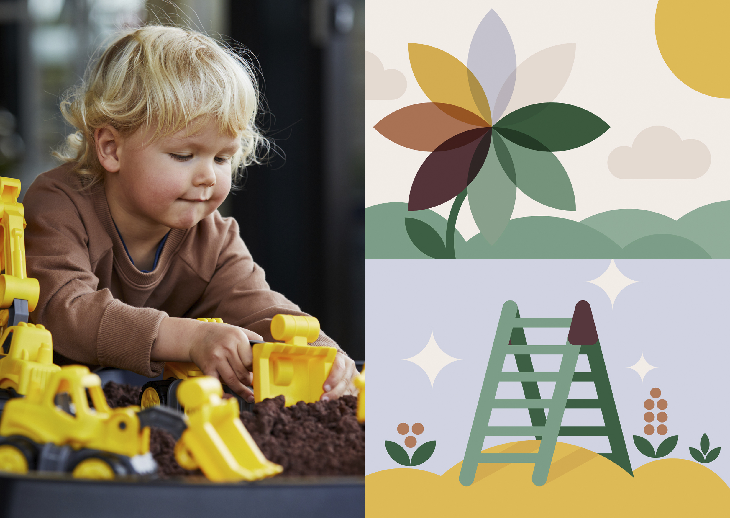
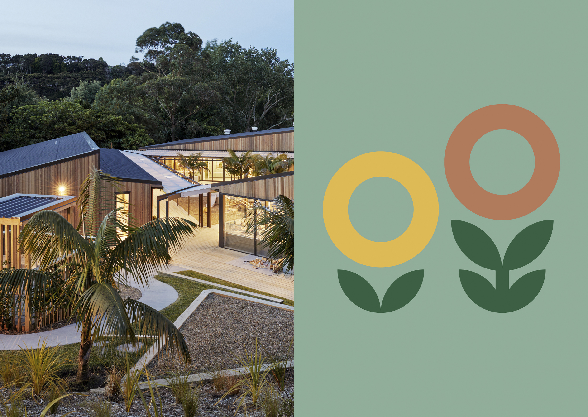
New Shoots is a New Zealand nationwide early childcare community with purpose-built and designed centres. While their architecturally award-winning centres were getting recognised as best in class, the brand’s identity felt dated and no longer reflected their physical enviroments, or their vision for the future.
Our team at Unified Brands were approached to develop a new brand platform and refresh visual identity for the brand. The proposition 'Naturally Inspired to Thrive' was developed - speaking directly to the benefit of being part of an exciting and modern environment, while tapping into what families want for their child's development.
From here onwards, I have led our creative team to sketch and explore how to bring this proposition to life in a simple, inspiring and unique way. We’ve gone through dozens and dozens of sketches until we arrived at our aha moment, and at that point, we knew we have unlocked something special.
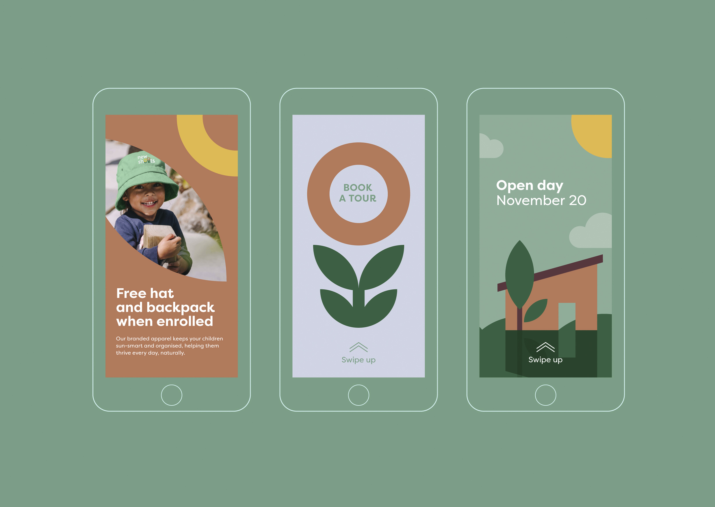
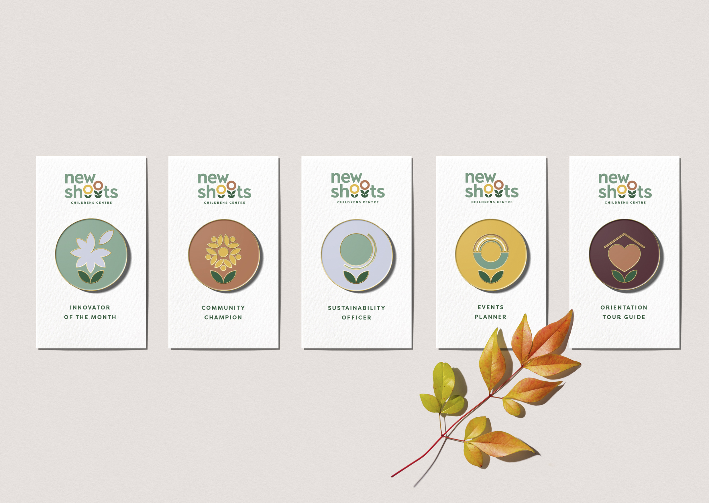
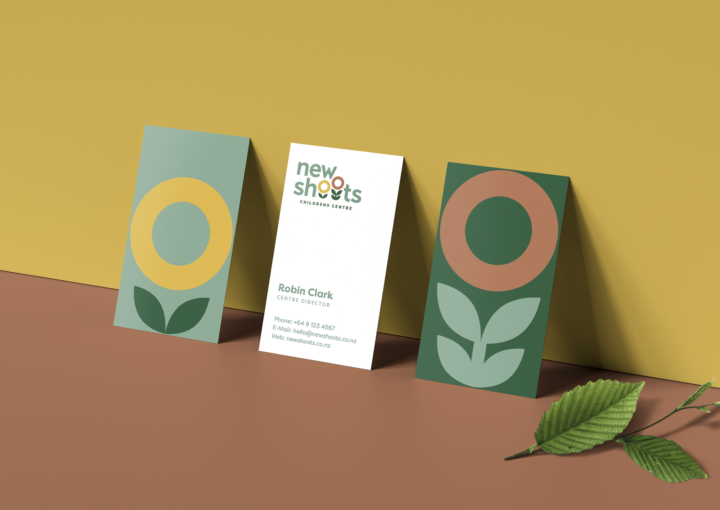
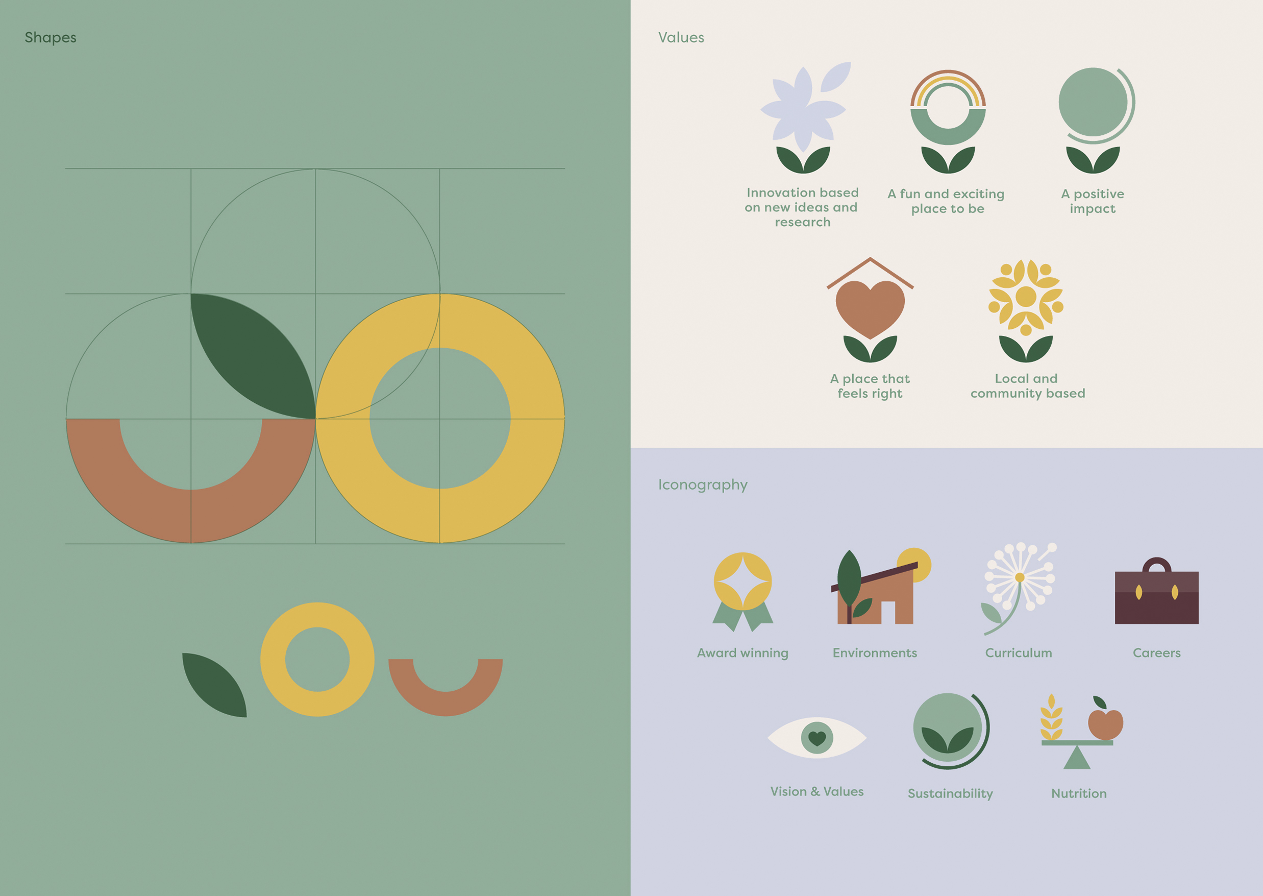
Our newly refreshed logo uses a modern, clean sans serif wordmark – crafted to feel both inspiring and approachable. Part of the new logo is an icon that resembles plants rising up from the ground. This icon, or as we call it - ‘Thriving Shoots’, represent the children and people that make up the New Shoots community, growing together side by side; nurtured, supported and inspired to naturally thrive.
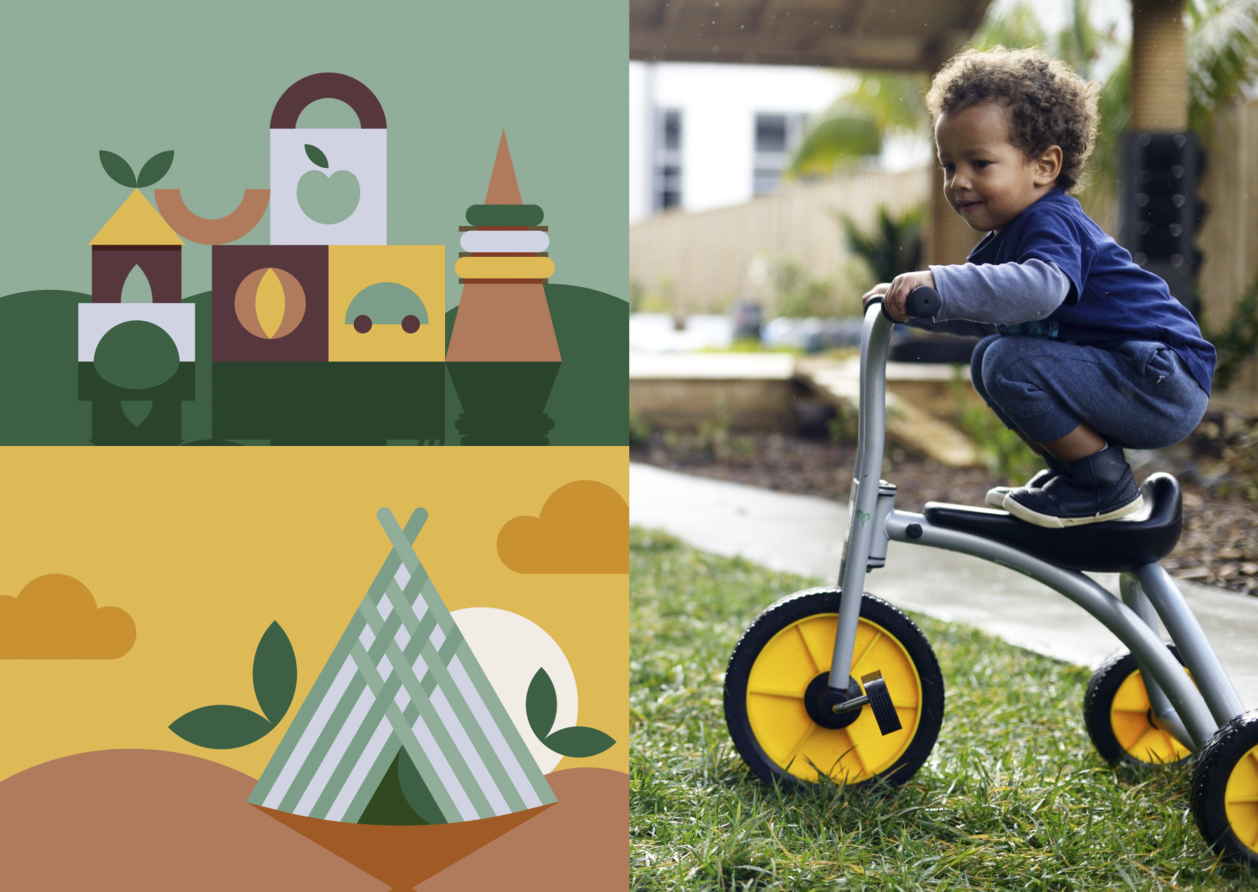
The logo was complimented with a colour palette drawn from nature, together with a stylised geometric aesthetic flowing harmoniously throughout all iconography and illustrated assets.
The result is a warm and engaging new identity, which truly reflects New Shoots brand values. It’s a change which has been embraced by the business and its community, and has been rolled out nationally across the centres.
︎ Agency: Unified Brands
︎ Client Service & Strategy: Mike Robertson, Nicole McClure
︎ Design Direction: Melissa Doria
︎ Creative Team: Melissa Doria, Emma Lawrence, Alisha Kay, Ann Davenport, Chiara Ronchi, Sonja Fritz
New Shoots is a New Zealand nationwide early childcare community with purpose-built and designed centres. While their architecturally award-winning centres were getting recognised as best in class, the brand’s identity felt dated and no longer reflected their physical enviroments, or their vision for the future.
Our team at Unified Brands were approached to develop a new brand platform and refresh visual identity for the brand. The proposition 'Naturally Inspired to Thrive' was developed - speaking directly to the benefit of being part of an exciting and modern environment, while tapping into what families want for their child's development.
From here onwards, I have led our creative team to sketch and explore how to bring this proposition to life in a simple, inspiring and unique way. We’ve gone through dozens and dozens of sketches until we arrived at our aha moment, and at that point, we knew we have unlocked something special.
Our newly refreshed logo uses a modern, clean sans serif wordmark – crafted to feel both inspiring and approachable. Part of the new logo is an icon that resembles plants rising up from the ground. This icon, or as we call it - ‘Thriving Shoots’, represent the children and people that make up the New Shoots community, growing together side by side; nurtured, supported and inspired to naturally thrive.
The logo was complimented with a colour palette drawn from nature, together with a stylised geometric aesthetic flowing harmoniously throughout all iconography and illustrated assets.
The result is a warm and engaging new identity, which truly reflects New Shoots brand values. It’s a change which has been embraced by the business and its community, and has been rolled out nationally across the centres.