Bare Bones
Branding, Packaging
Creative Direction, Design & Illustration
︎ Client: Kraft Heinz Australia
︎ Agency: Unified Brands
︎ Client Service & Strategy: Mike Robertson, Britt Rigoni, Zelda Senekal
︎ Design Director: Melissa Doria
︎ Creative Team: Melissa Doria, Emma Lawrence
︎ Case Study Photography: Mark Lobo, Melissa Doria
Gravy is an important chunk of business for Kraft Heinz in Australia, where they currently have the Gravox brand. Since the category had been seen as one full of heavily processed and unhealthy products, the idea of a clean bone-based broth with nothing to hide was developed by Kraft Heinz, who came to Unified Brands team to help create and visualise this new brand.
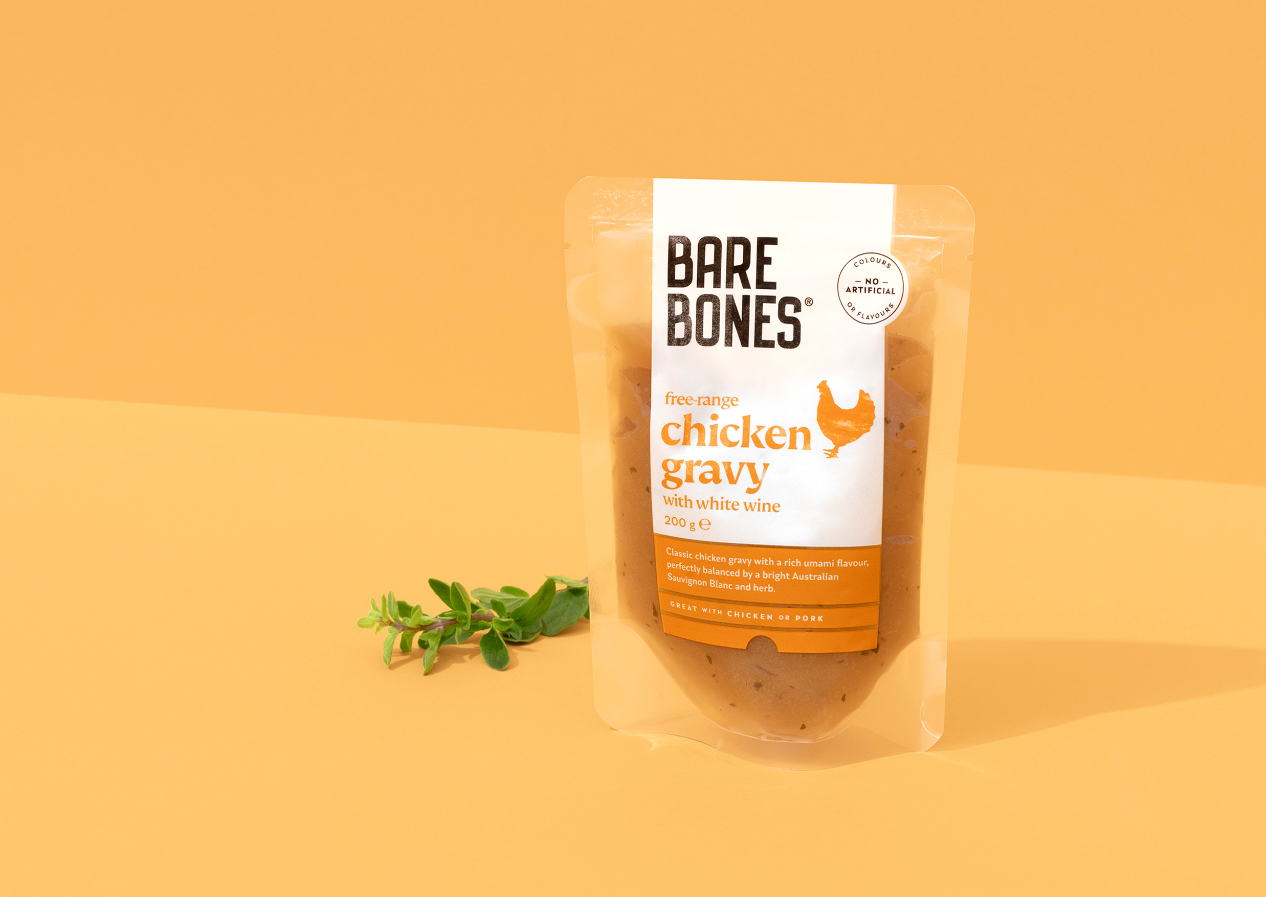
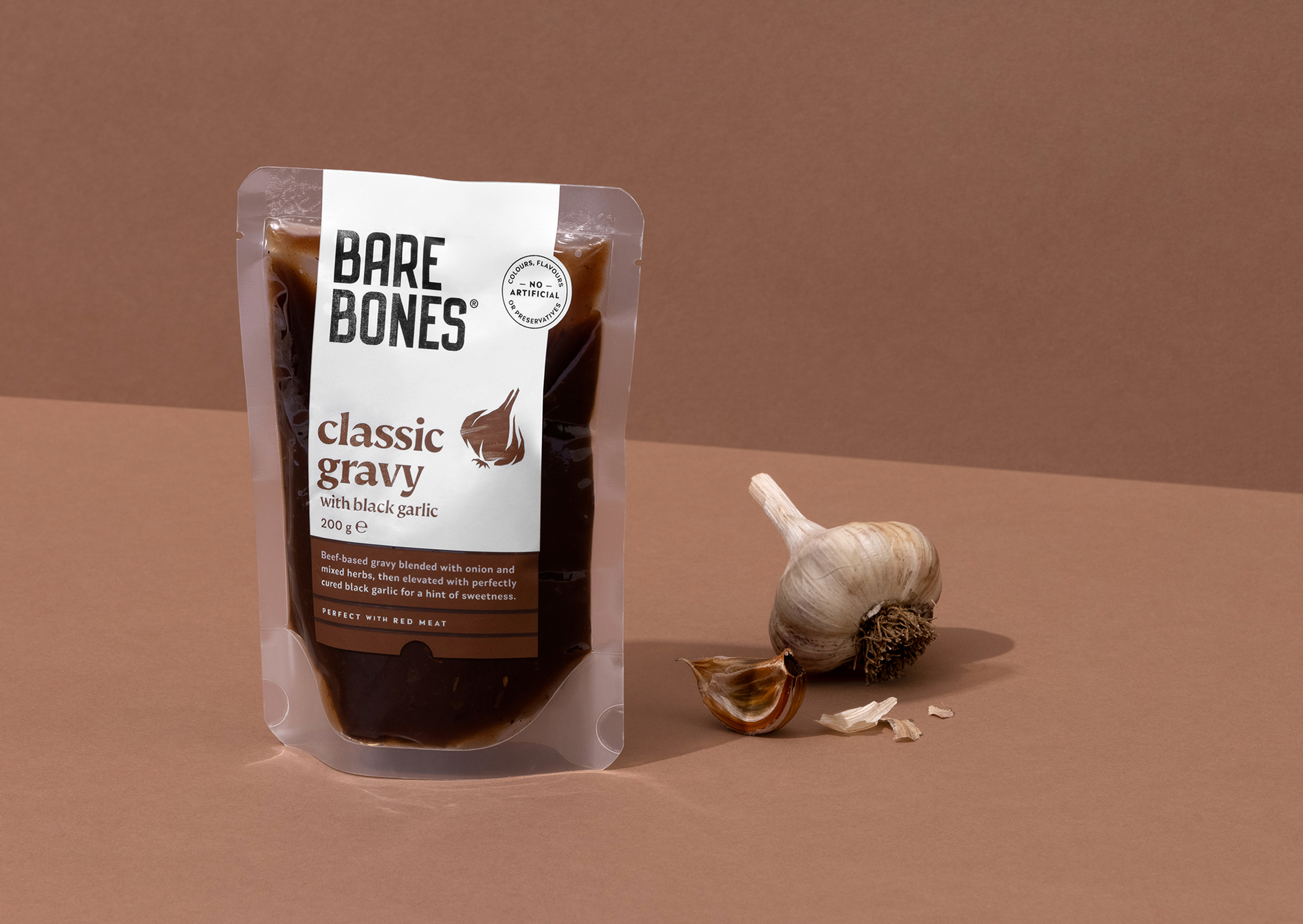
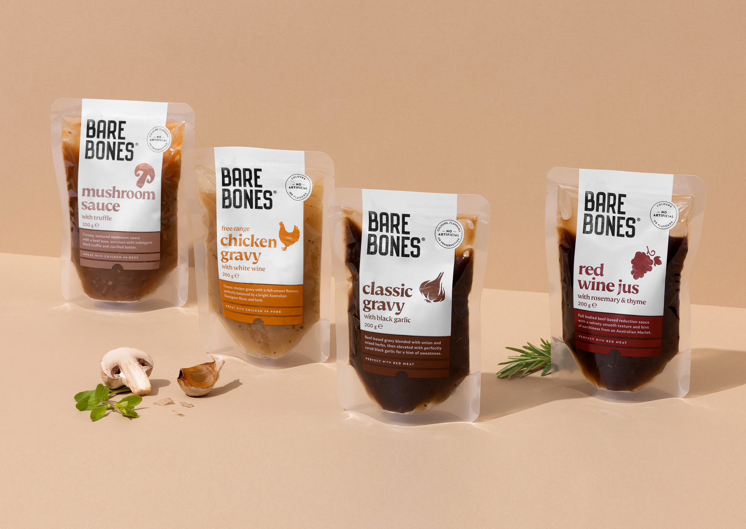
Our design idea was ‘Flavours Laid Bare’, which helped us arrive at a stripped back visual direction that felt natural, frank and authentic. Fresh for a supermarket isle crowded by shouty, over-visualised packaging.
Bare Bones was one of the first Aussie brand launch projects that our Unified Brands team got to work on. Luckily, I not only had a chance to oversee it start-to-finish but also create the (bare) bones of the design and work on illustration.
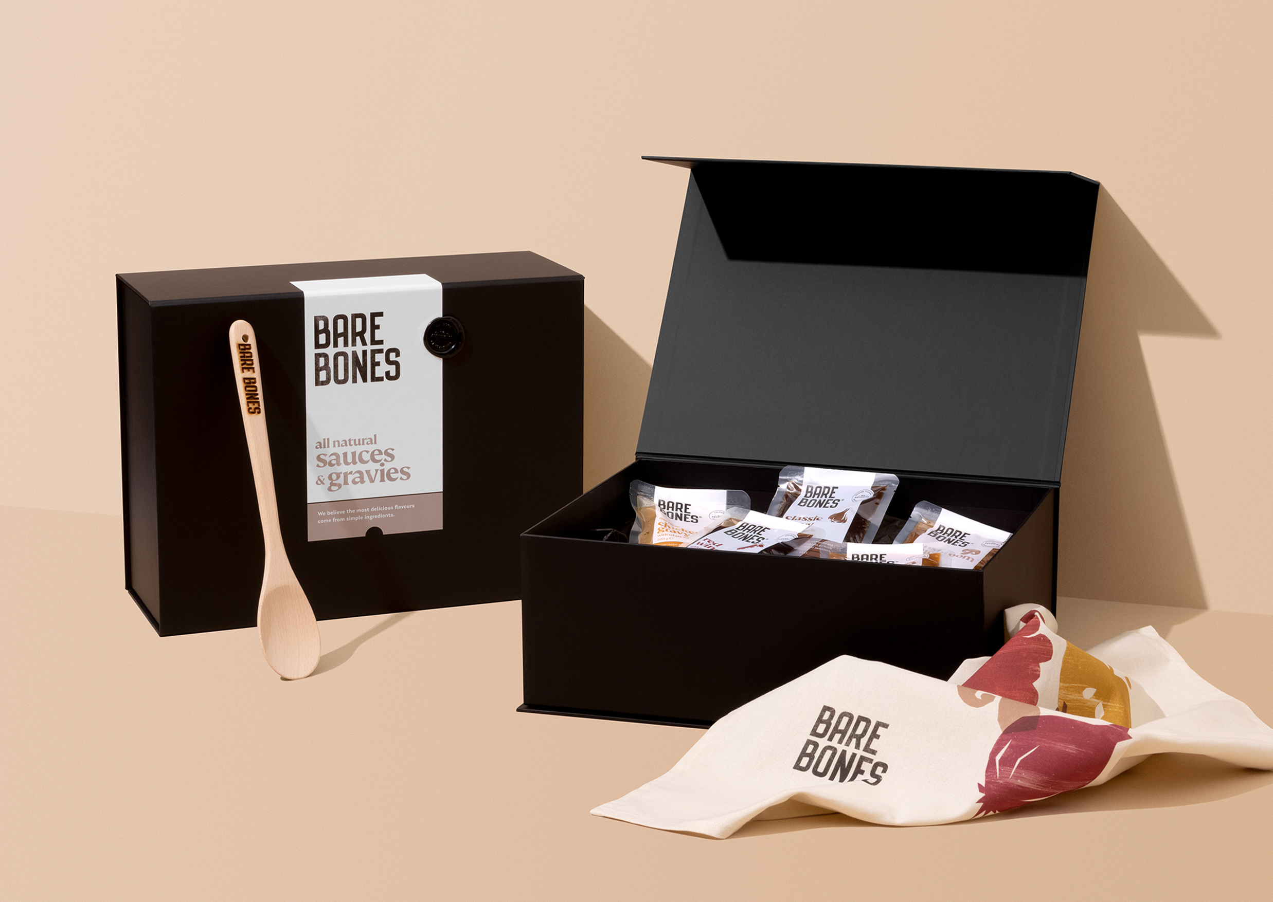
The bold and confidently condensed angular brand mark created a juxtaposition with a more elegant, simple brand typography. The use of white space added to the natural look while the abundance of the shown-through product gave it that honest no-nasties feel.
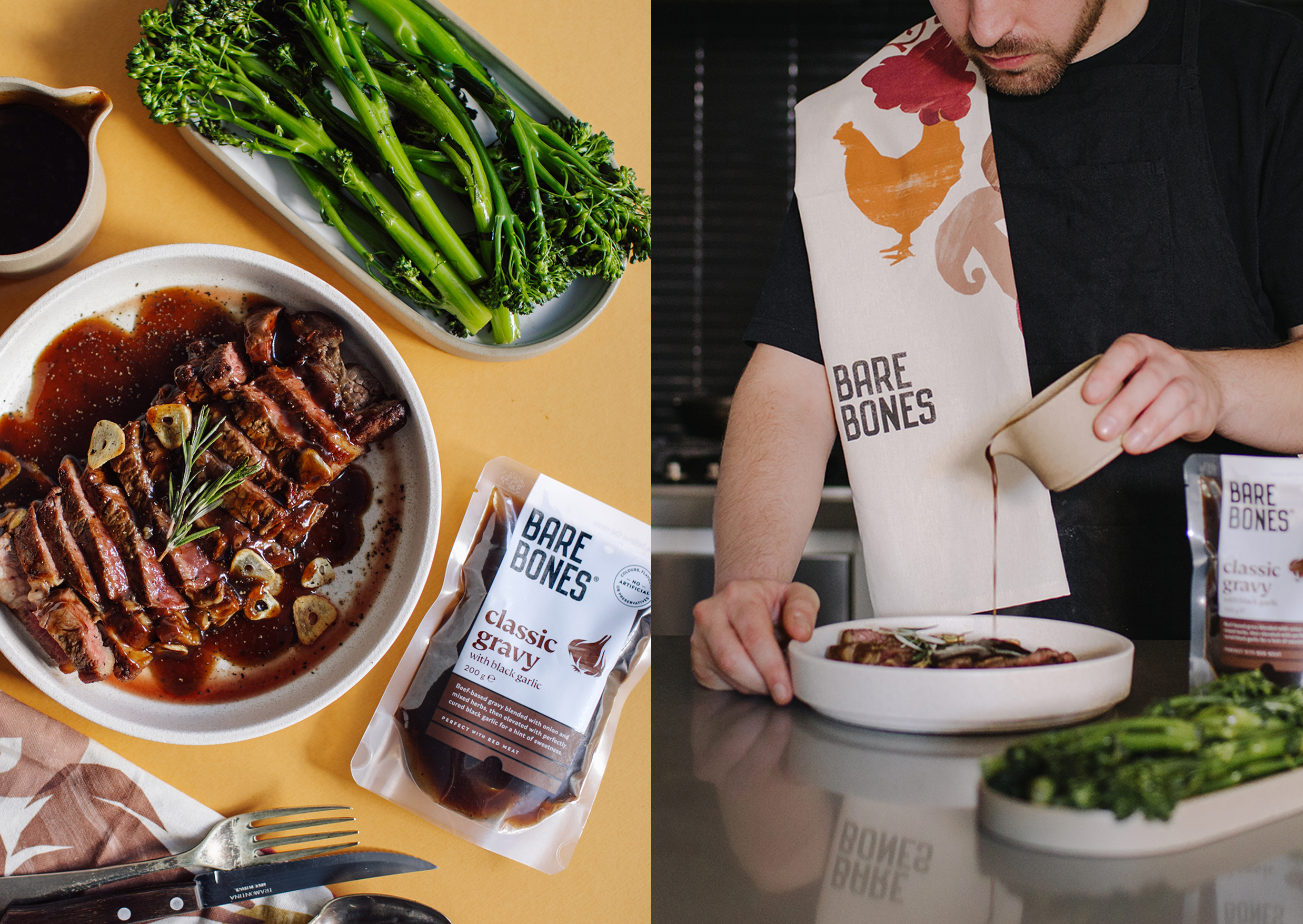
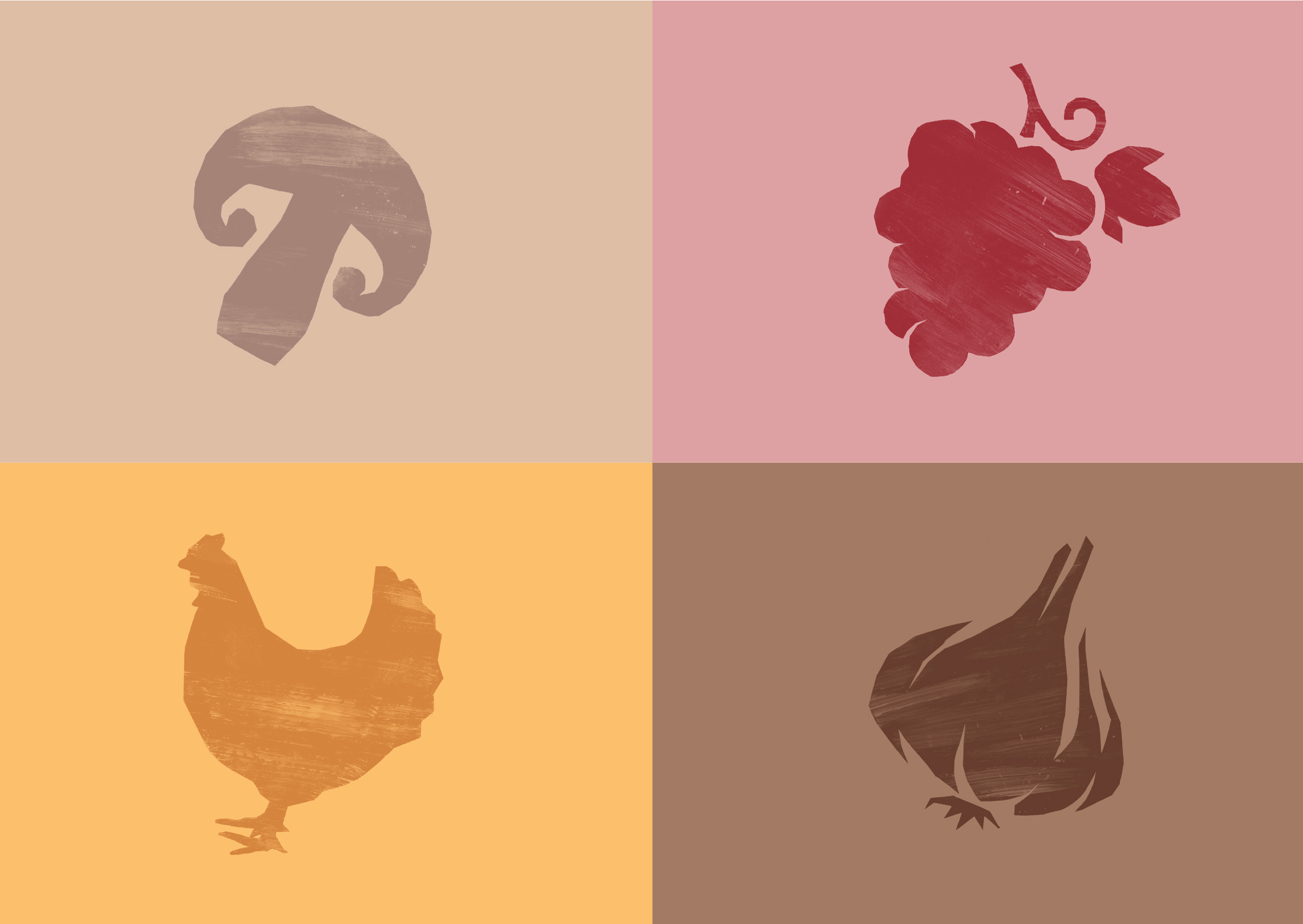
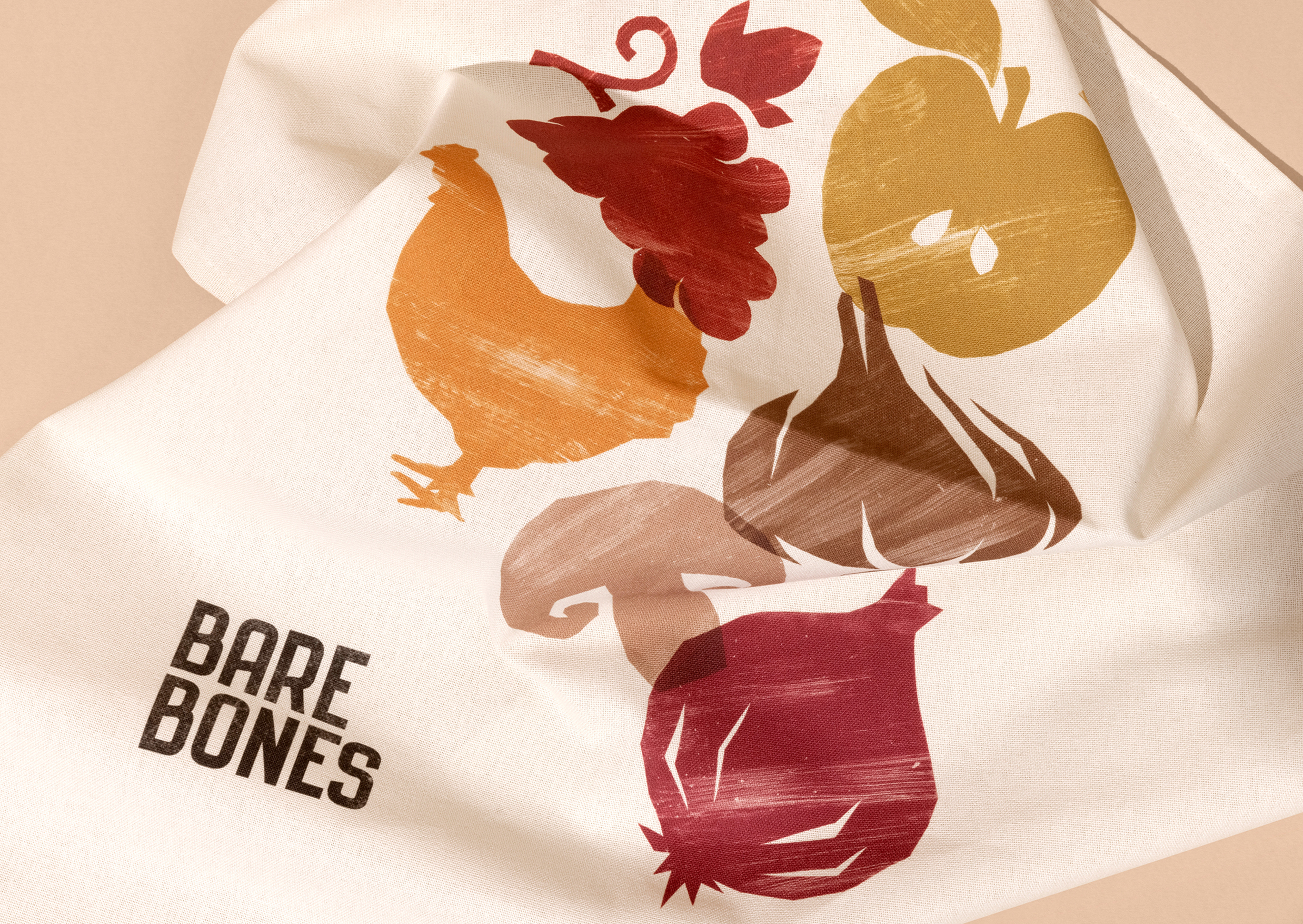
To strike a balance between simplicity and quality, we have cut-out the shapes of key ingredients, applying expressive paint brush strokes to them by hand. These, in combination with natural textures, created a tactile brand visual language that we then used to expand to other brand applications off-pack.

