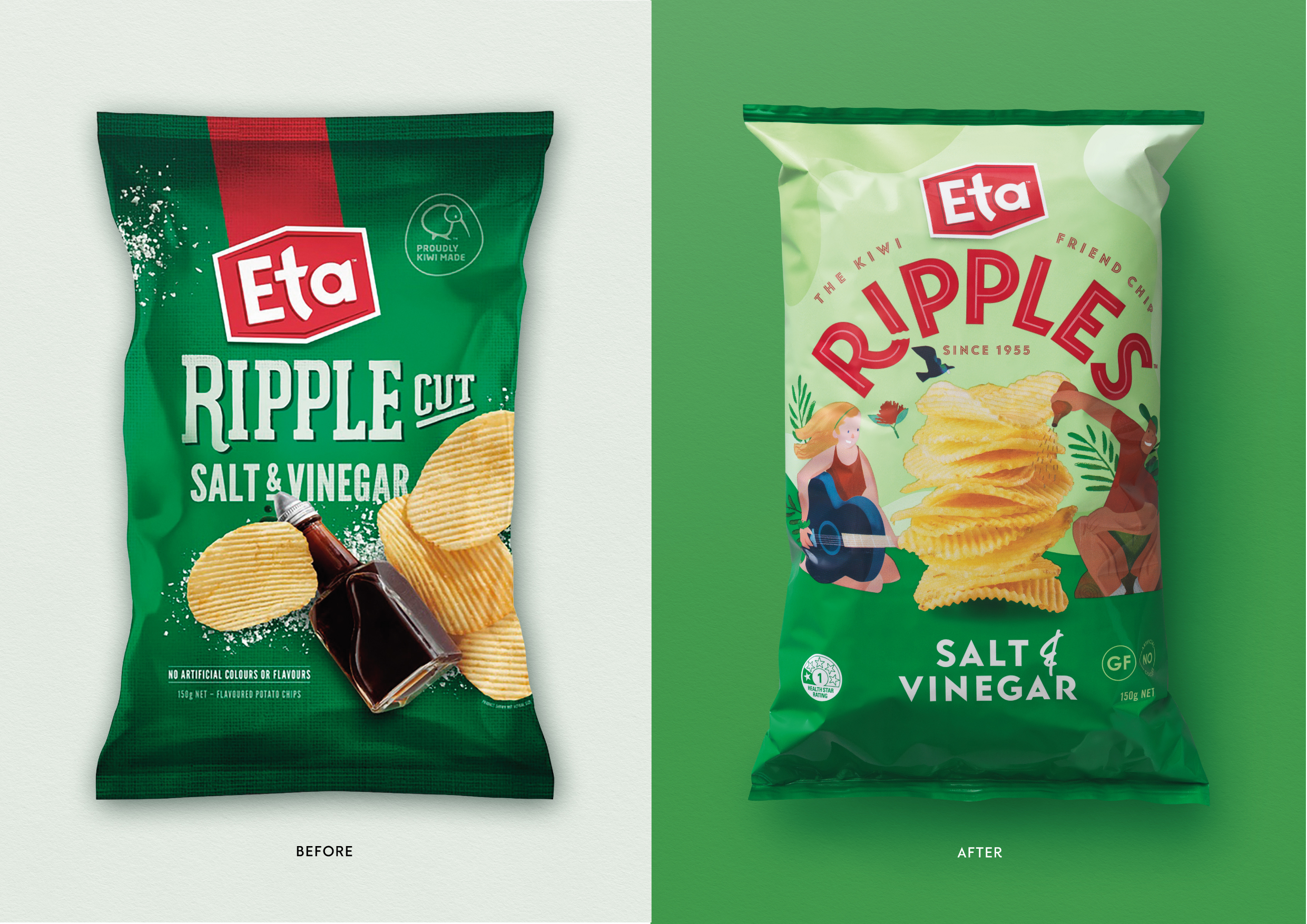
ETA Ripples
Branding, Packaging
Creative Direction & Design
︎ Client: Griffins
︎ Agency: Unified Brands
︎ Client Service & Strategy: Mike Robertson, Zelda Senekal, Nicole McClure, Paige Flemming
︎ Design Director: Melissa Doria
︎ Creative Team: Melissa Doria, Emma Lawrence, Alisha Kay
︎ Illustration: Daron Parton
︎ Case Study Photography: Ann Davenport, Yuki Sato
The Eta brand was becoming forgettable. It was the chip brand people grew up with but it had lost relevance with New Zealand’s younger consumers, and was no longer the brand of choice in the chip aisle. Our team at Unified Brands was tasked with bringing life back into Eta’s iconic Ripples chips.
As a Creative Director, I had to lead the creative team through the very tricky snacking category to help us arrive at a place that would help make the brand popular once again
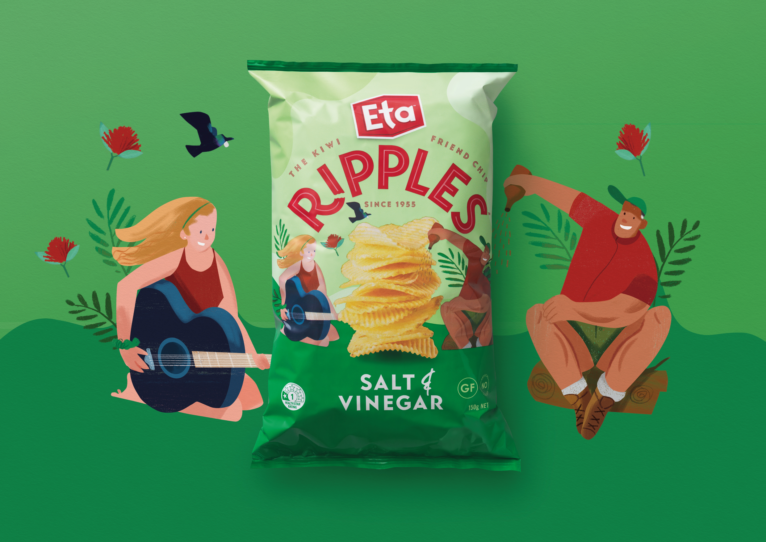
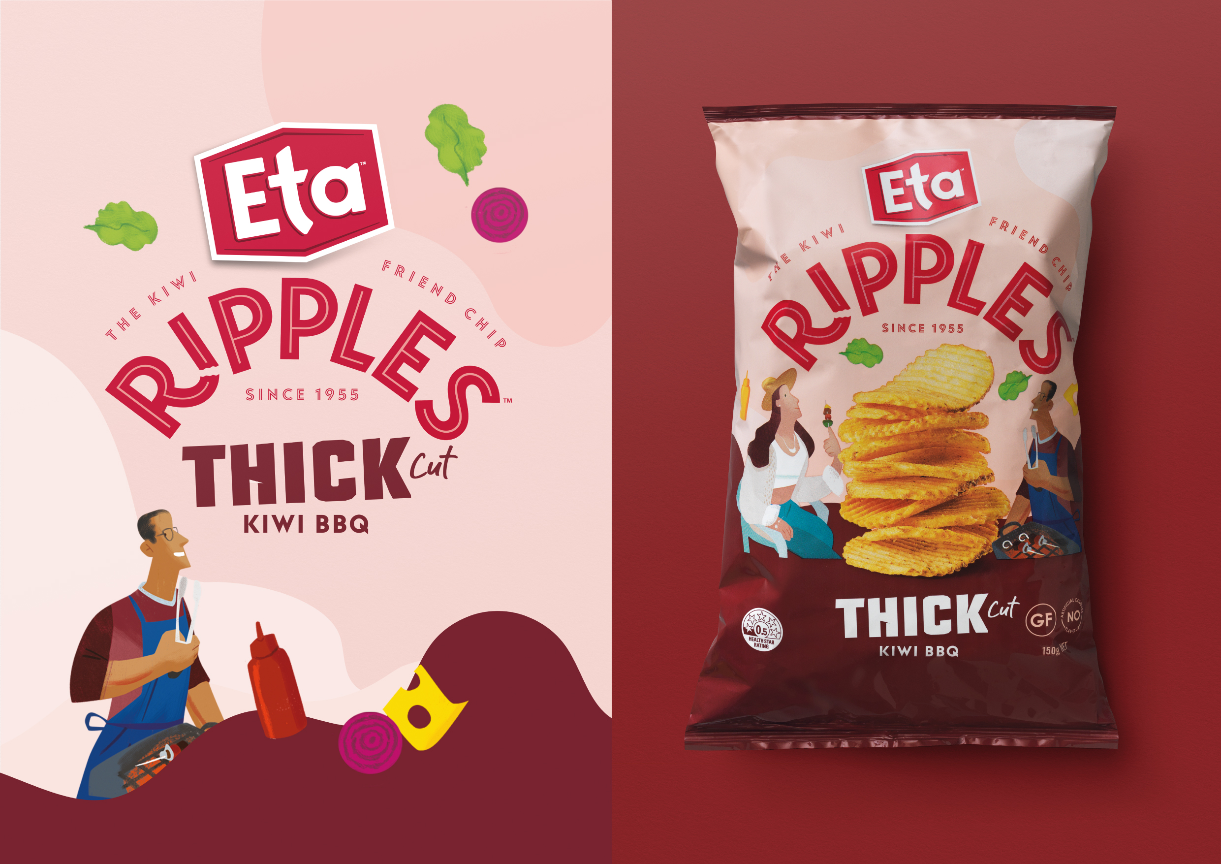
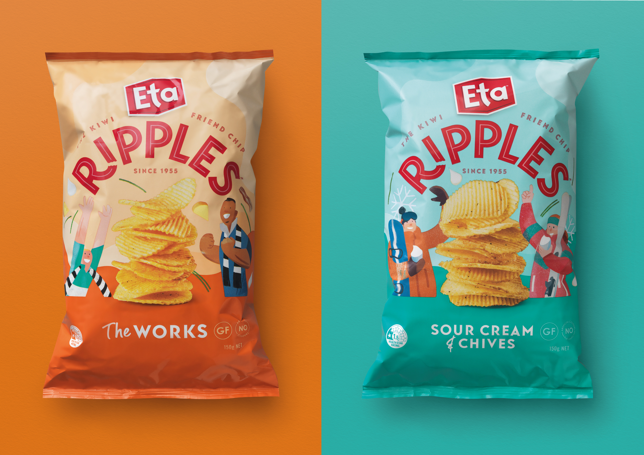
Creating a story for the brand to tell through our design, we developed continuously connected social scenarios that brought kiwis together. We worked with illustrator Daron Parton, to create bespoke characters and scenes for each variant. Each of the packs captured a different social occasion and helped us bring to life the different flavour profiles across the range.
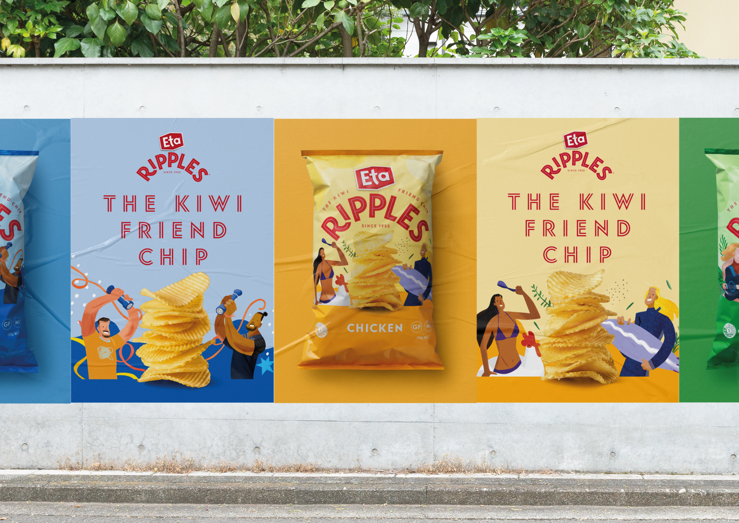
In the attention-demanding snacking aisle often swarmed with images of flying 3D chips and snacks, we’ve gone for a look that would stand-out for its freshness and modernity. Pastel colours became backdrops for our illustrations while the bold variant colour palette introduced a bit of fun and vibrancy into the range. Clean geometric typography helped us create a clear navigation. Connecting all the dots together, we introduced a new ‘The Kiwi Friend Chip’ tagline that reflected the playfulness of our illustrated characters and linked to the brand's new ‘Feeding Friendship’ platform.
The result is a highly successful relaunch of Eta Ripples, with a bold new look which has allowed the brand to reconnect with New Zealand consumers.

