NOM
Branding, Packaging
Creative Direction & Design
︎ Client: James Crisp
︎ Agency: Unified Brands
︎ Client Service & Strategy: Mike Robertson, Nicole McClure, Zelda Senekal
︎ Design Director: Ann Davenport
︎ Creative Team: Ann Davenport, Alisha Kay, Emma Lawrence
︎ Copywriting: Mark Easterbrook
︎ Illustration: Ann Davenport
NOM is a Kiwi-born brand of bite-sized treats that take indulging to a new level. To help launch NOM and create its identity, our team at Unified Brands was approached with a simple and inspiring brief: stimulate the senses and be boldly creative.
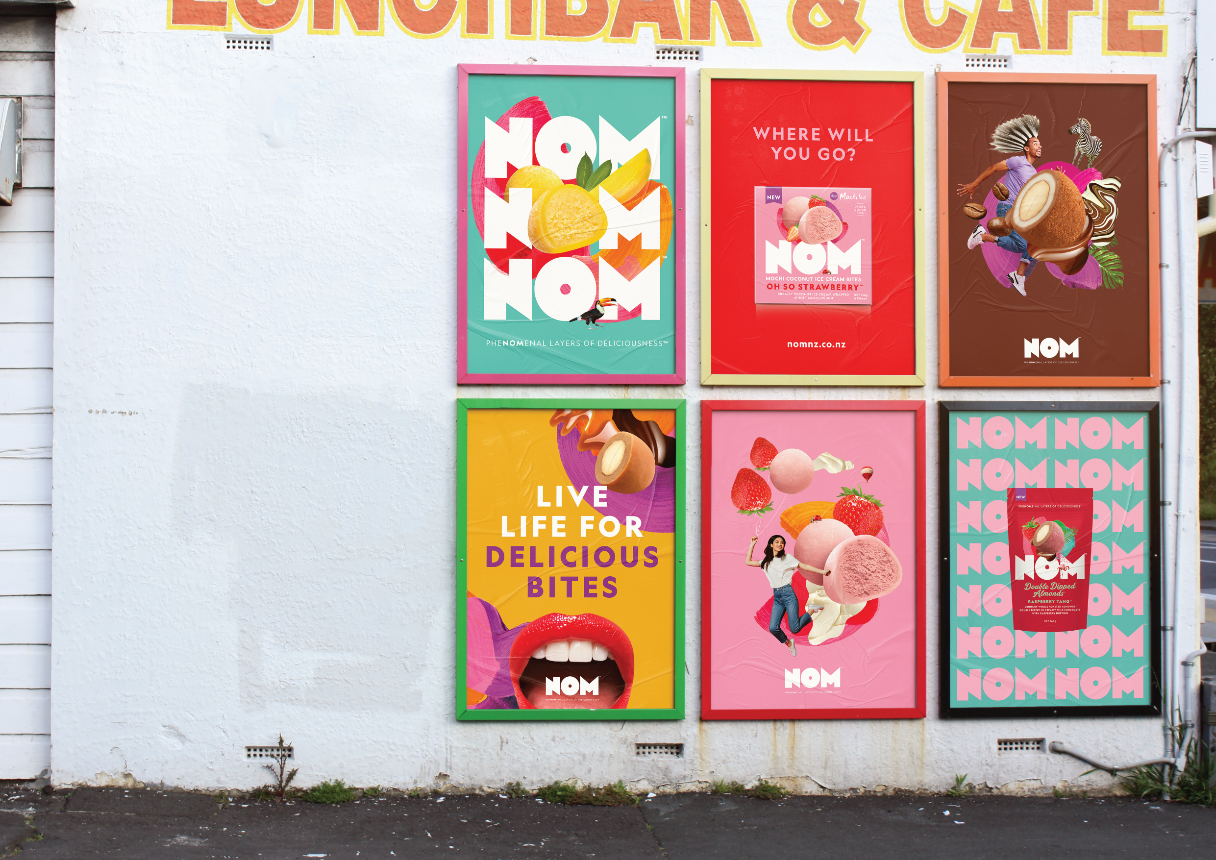
Our team developed a brand platform that revolved around the idea of creating magical bite-sized moments. Of course, the visual world of magic can, quite literally, take you down the rabbit hole of fairy tales, the supernatural, and whimsical fantasies - all that traditional, pastiche and same-old stuff. Instead our version of magic was about what’s within our reach - those special moments in our everyday when we discover something beautiful that has a larger than life feel about it.
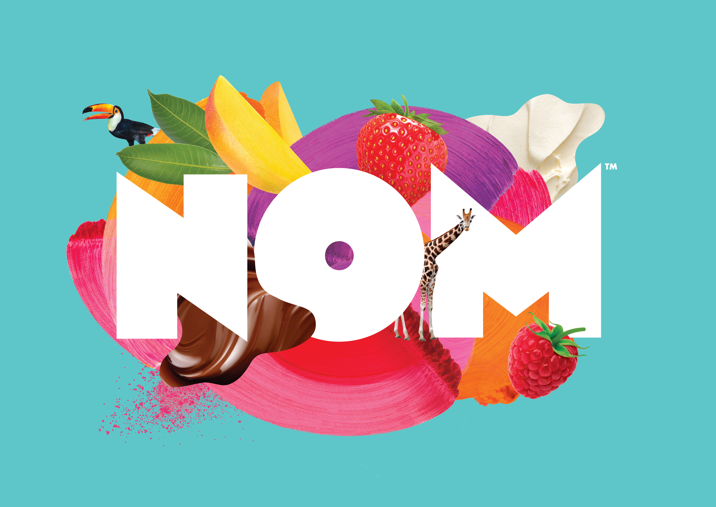
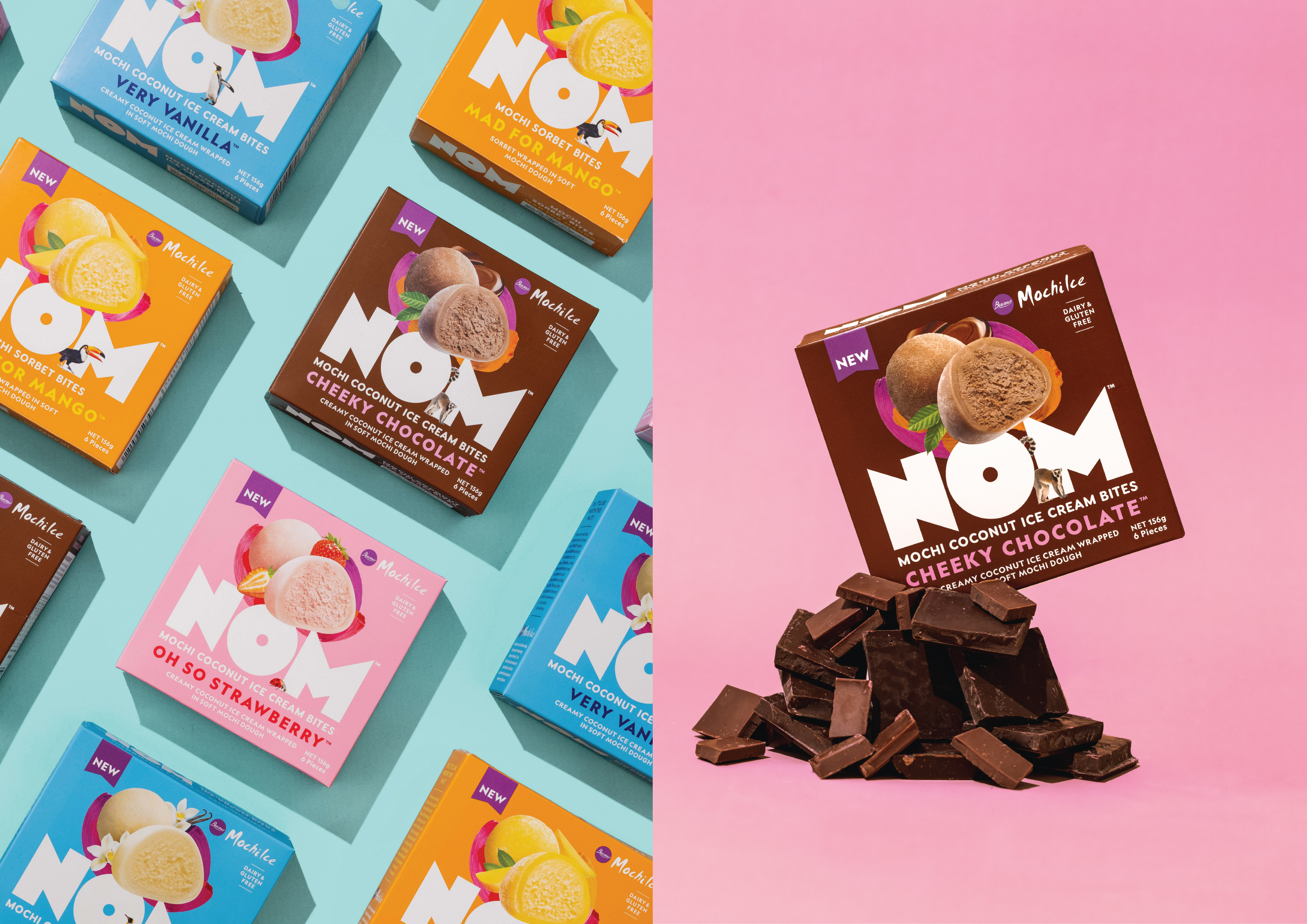
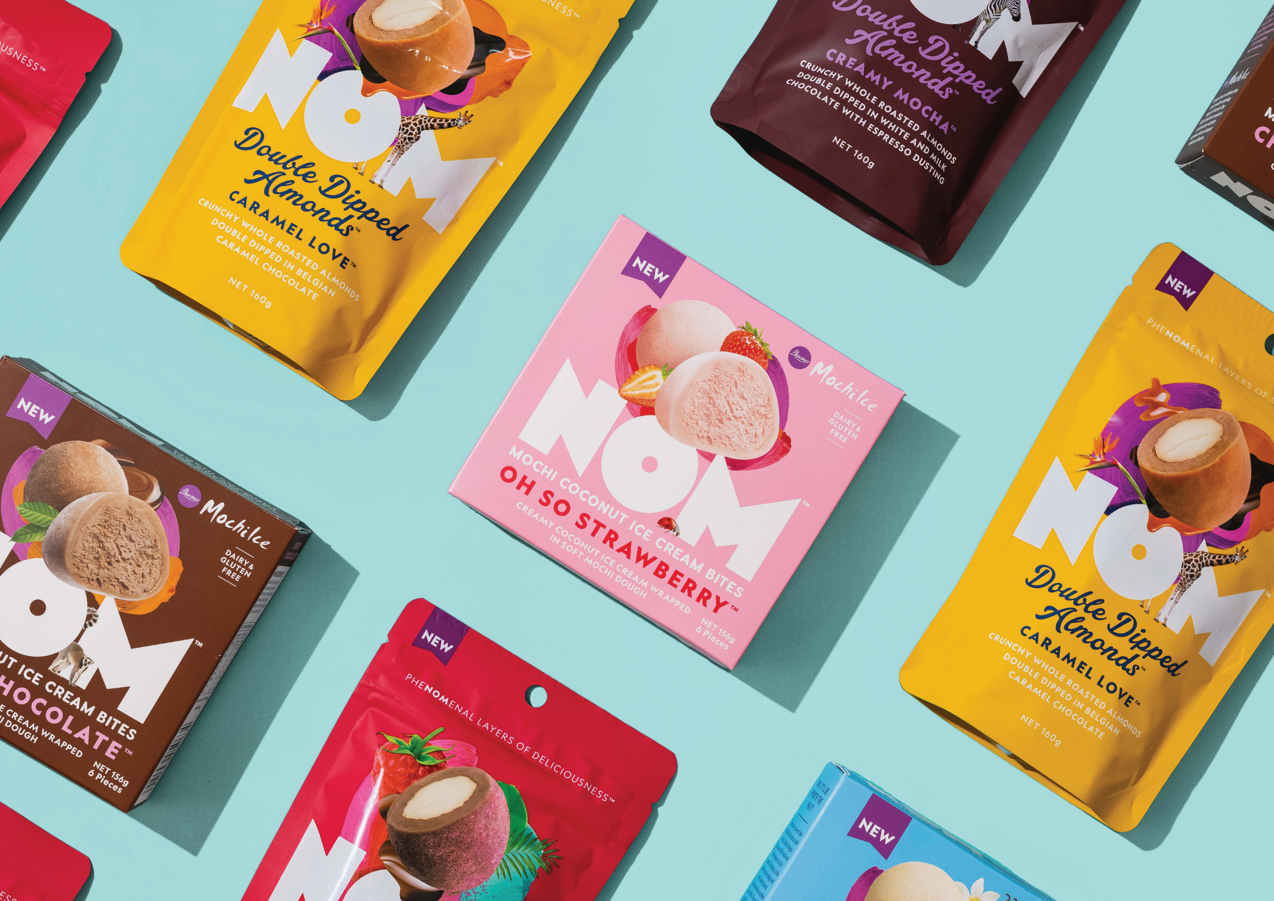
To bring this thinking to life, I worked clsoely with our Design Director to create a series of collages that represented moments when you bite into NOM and get transported out of the everyday, to somewhere phenomenal. These collages helped us bring together textures, layers and flavours of each NOM product and became the centerpiece of the brand’s visual language.
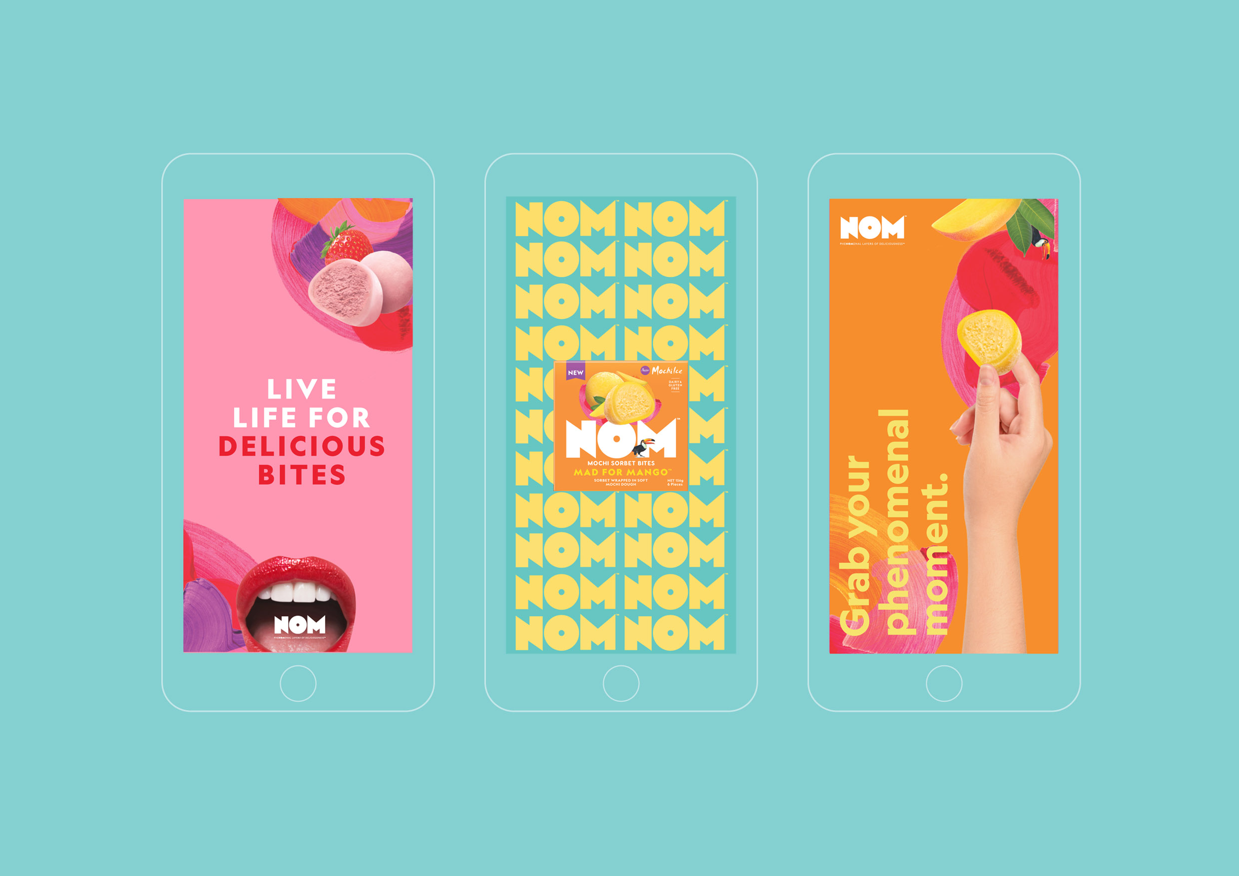
Paired with a deliciously vibrant colour palette and the bold yummy logo which creates a powerful focal point of its own, we created a joyous and evocative brand identity that felt contemporary and fresh.

