Nourish
Branding, Packaging
Creative Direction, Design & Lettering


︎ Client: Earthwise
︎ Agency: Unified Brands
︎ Client Service & Strategy: Mike Robertson, Nicole McClure, Zelda Senekal
︎ Design Director: Melissa Doria, Ann Davenport
︎ Creative Artworker: Emma Lawrence
︎ Final Art: Will Wright
︎ Illustration: Ann Davenport
︎ Case Study Photography: Melissa Doria Yuki Sato
In a category experiencing growth, Earthwise was seeing a double-digit decline in Nourish, its natural personal care offering.
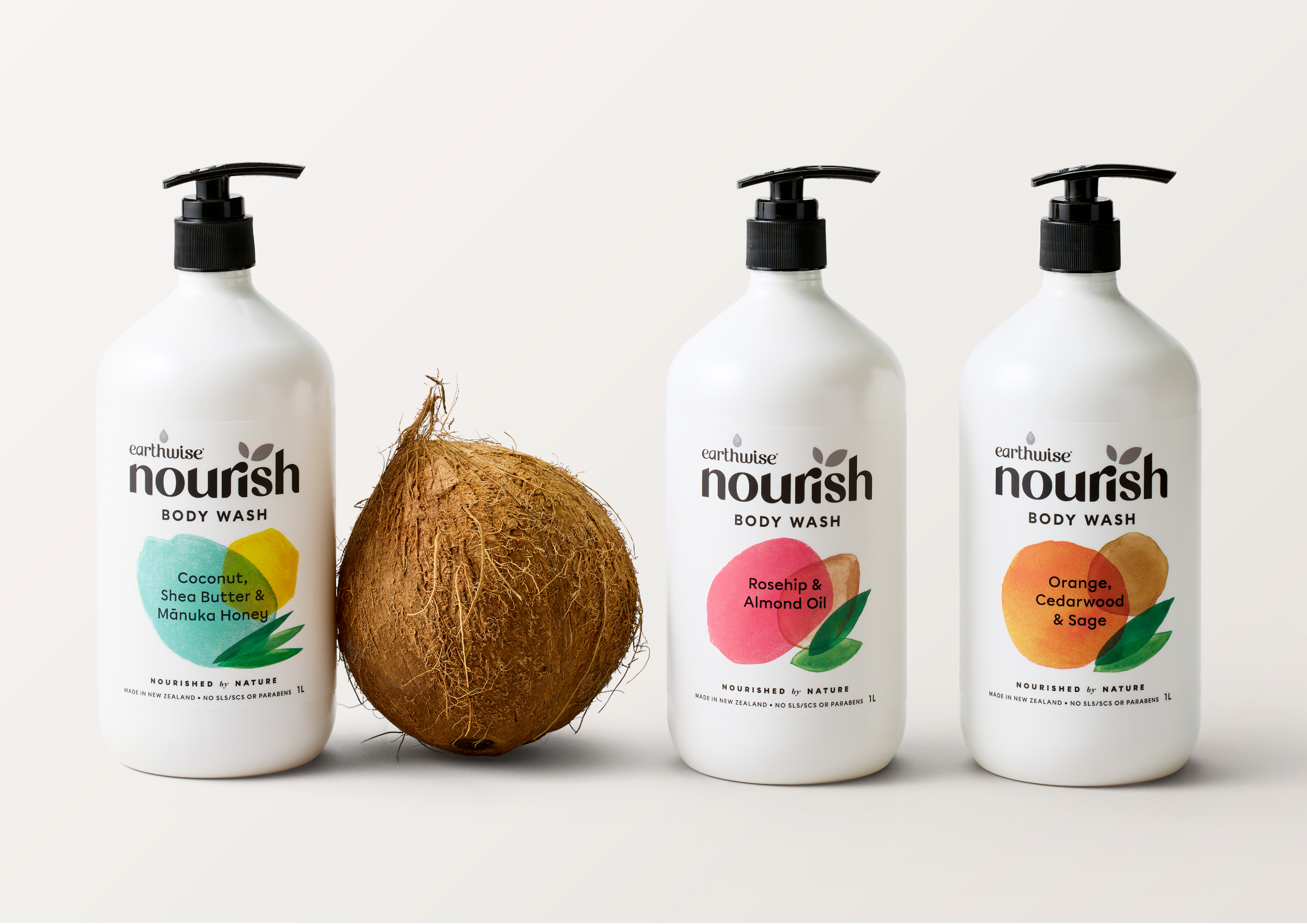
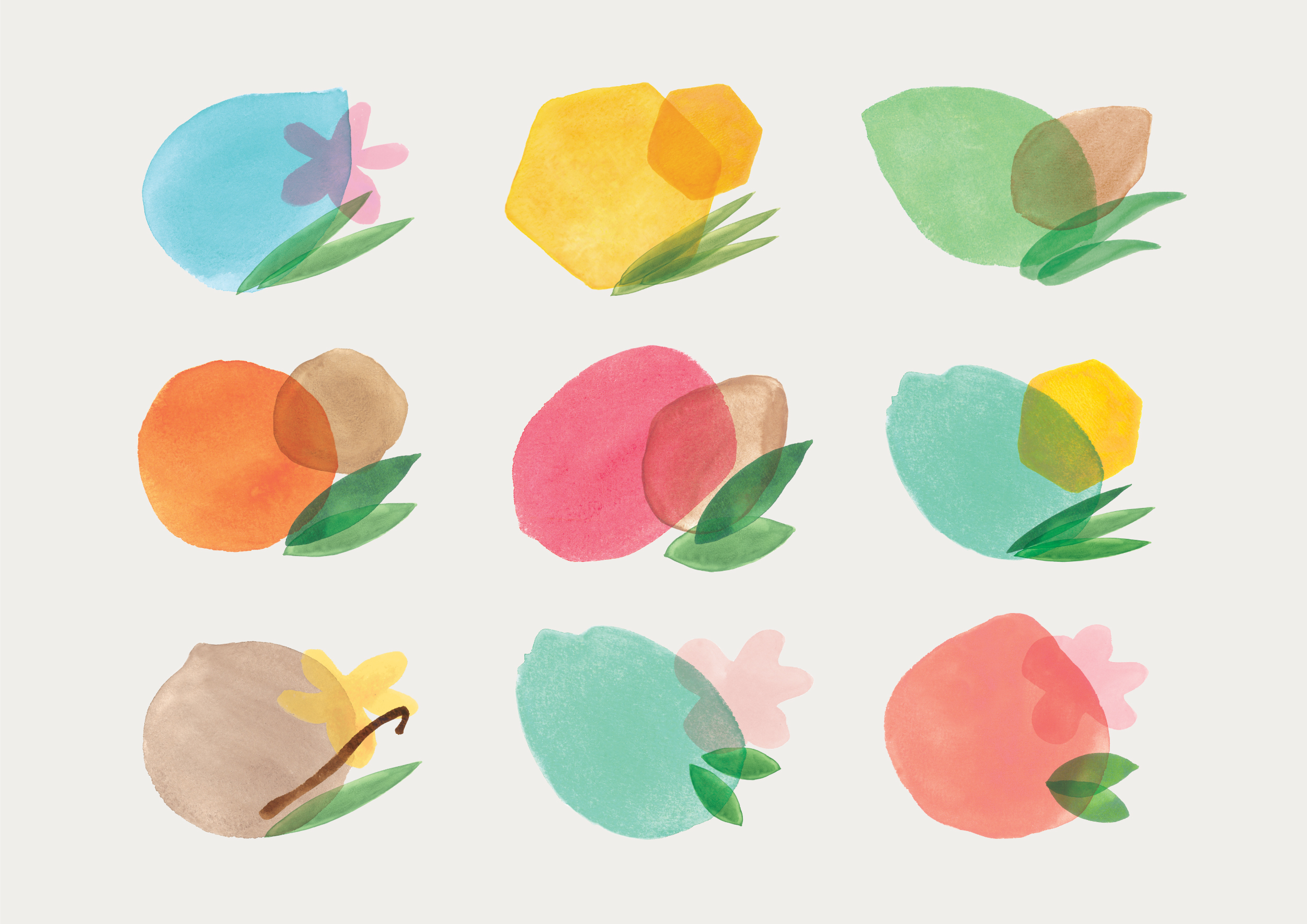
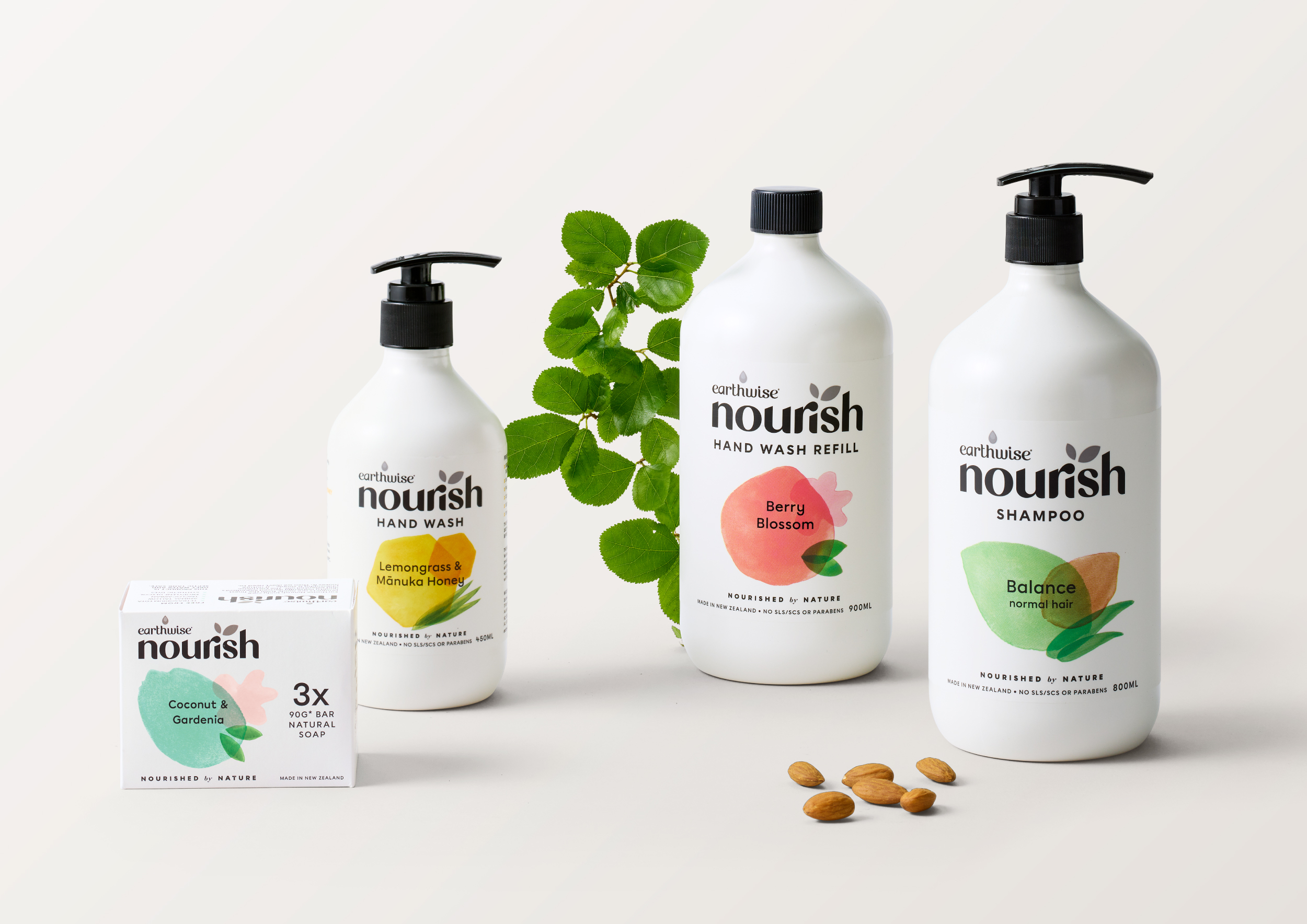
Together with the Unified team, we wanted to lean into the naturalness of Nourish’s formulations and celebrate the beauty of nature without taking the more obvious and often photographic style of actual ingredients, seen across most mainstream brands. Using abstract, organic shapes to reflect ingredients and scents, we were able to achieve a clean and sophisticated design that still felt gentle. These illustrated shapes, crafted beautifully by our Deisgn Director Ann Davenport, created a strong navigation system across the range, which had previously been lacking.
The wordmark has been has been completely redrawn to feel less clinical, as well as bring closer alignment to Earthwise.
