Wattie’s
Branding, Packaging
Creative Direction & Design
︎ Client: Kraft Heinz
︎ Agency: Unified Brands
︎ Client Service & Strategy: Mike Robertson, Zelda Senekal
︎ Creative Team: Chiara Ronchi, Chris Redditt, Emma Lawrence
︎ Case Study Photography: Shadowlands, Kayla Jurlina
For 80 years Wattie’s had been bringing generations of Kiwis together to share and enjoy great food, however while the brand had always been held dearly by New Zealanders, it was starting to lose its relevance, hence Wattie’s came to Unified Brands for a big scale rebrand.
As the first project that I led as a Creative Director at Unified Brands, taking on such an iconic Kiwi band was a huge task that was both scary and extremely exciting.
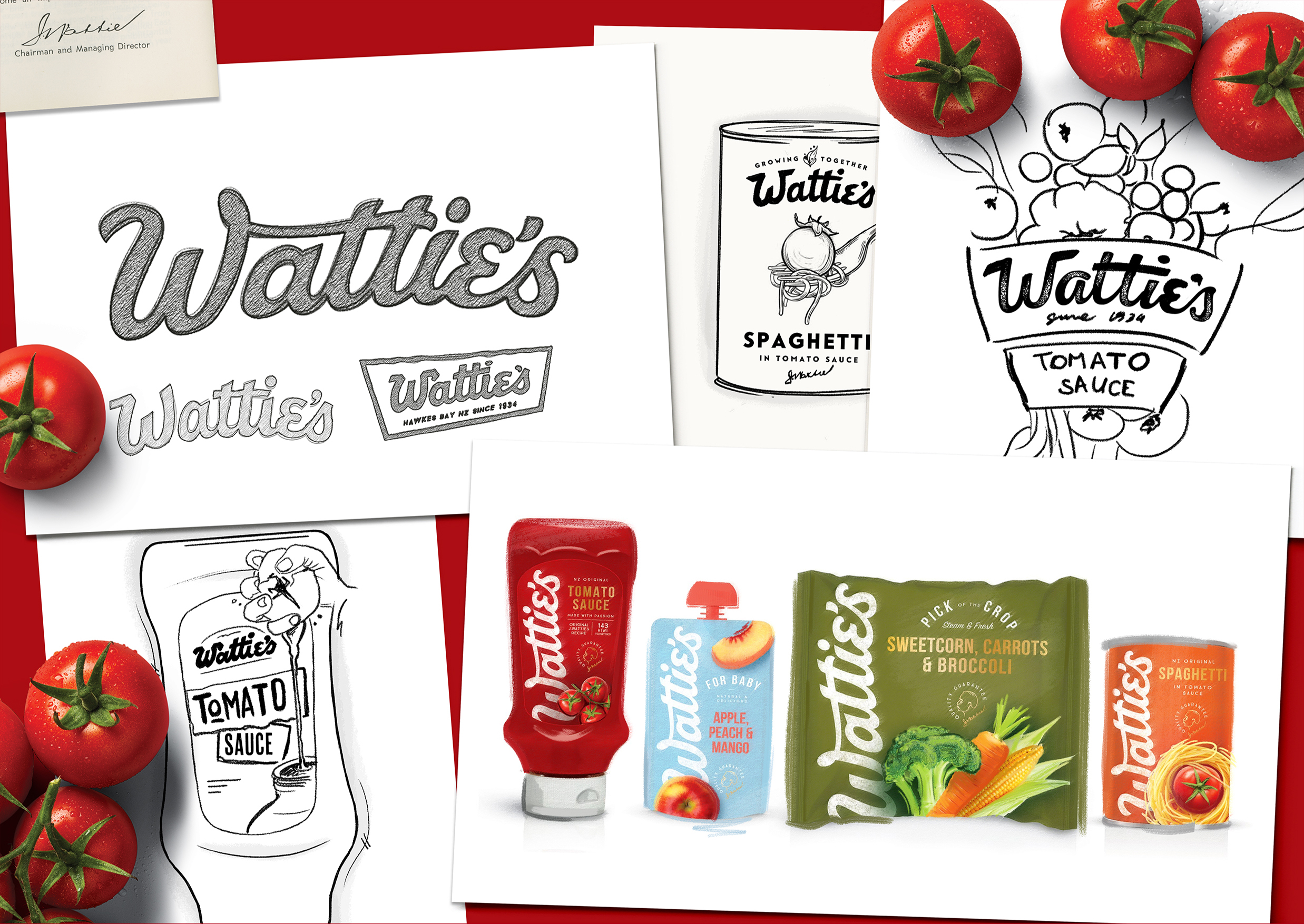
It was no secret that Wattie’s had always been a family brand, but over time the entrepreneurial spirit of its founder, Sir James Watties, had been overlooked. To reinvigorate the brand, we set to treat Wattie’s as the dynamic, adventurous entrepreneur that Sir James had been.
We injected the life back into the wordmark by playing on the quirky personality of typographic accents that are so iconically Wattie’s, weaving a more natural flow and craft into it along the way. I like to describe it as finding the perfect meeting point between heritage and modernity – comfortable but intriguing!
Controversially, we have even turned the brand on its head, quite literally, introducing a vertical logo in Wattie’s portfolio - simple, bold and proud, almost as if signed by Sir J. Wattie’s himself.
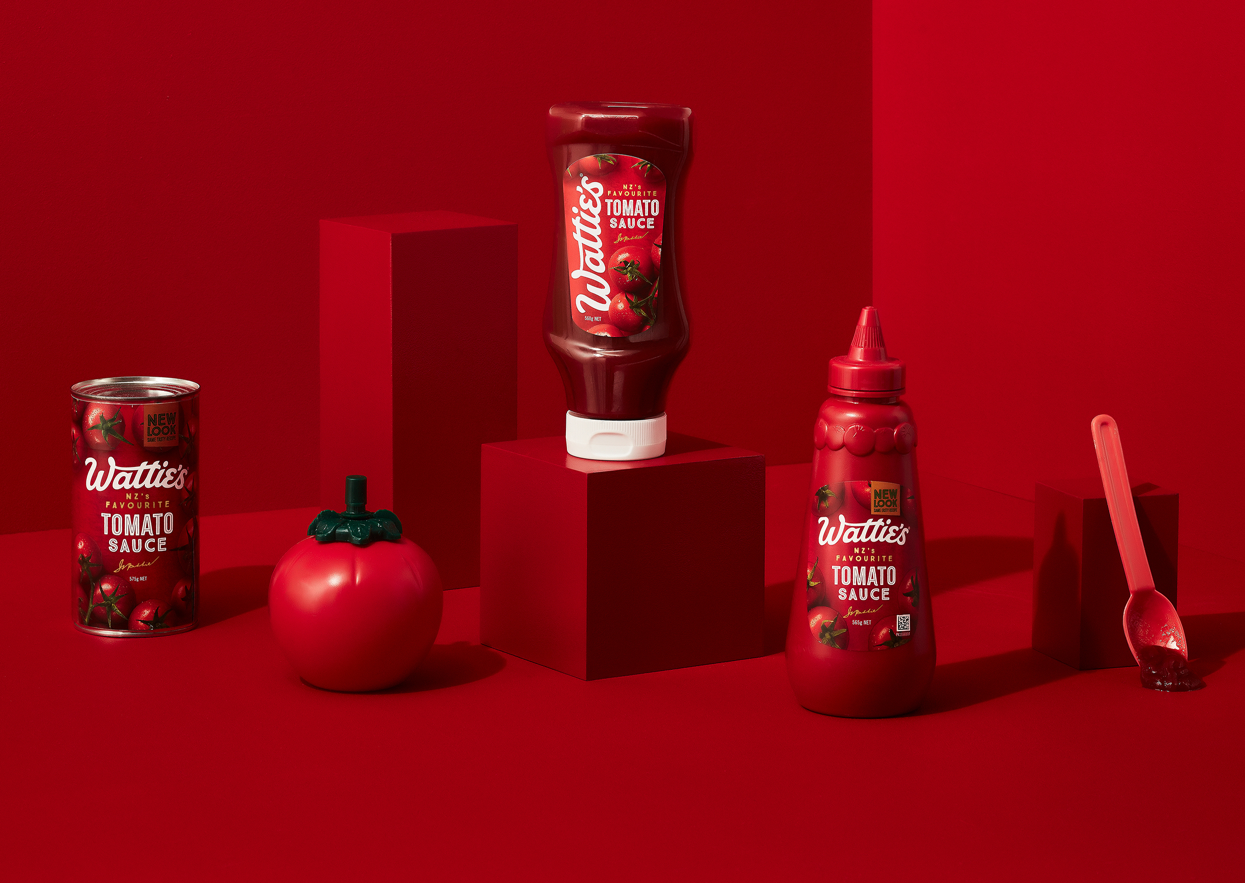
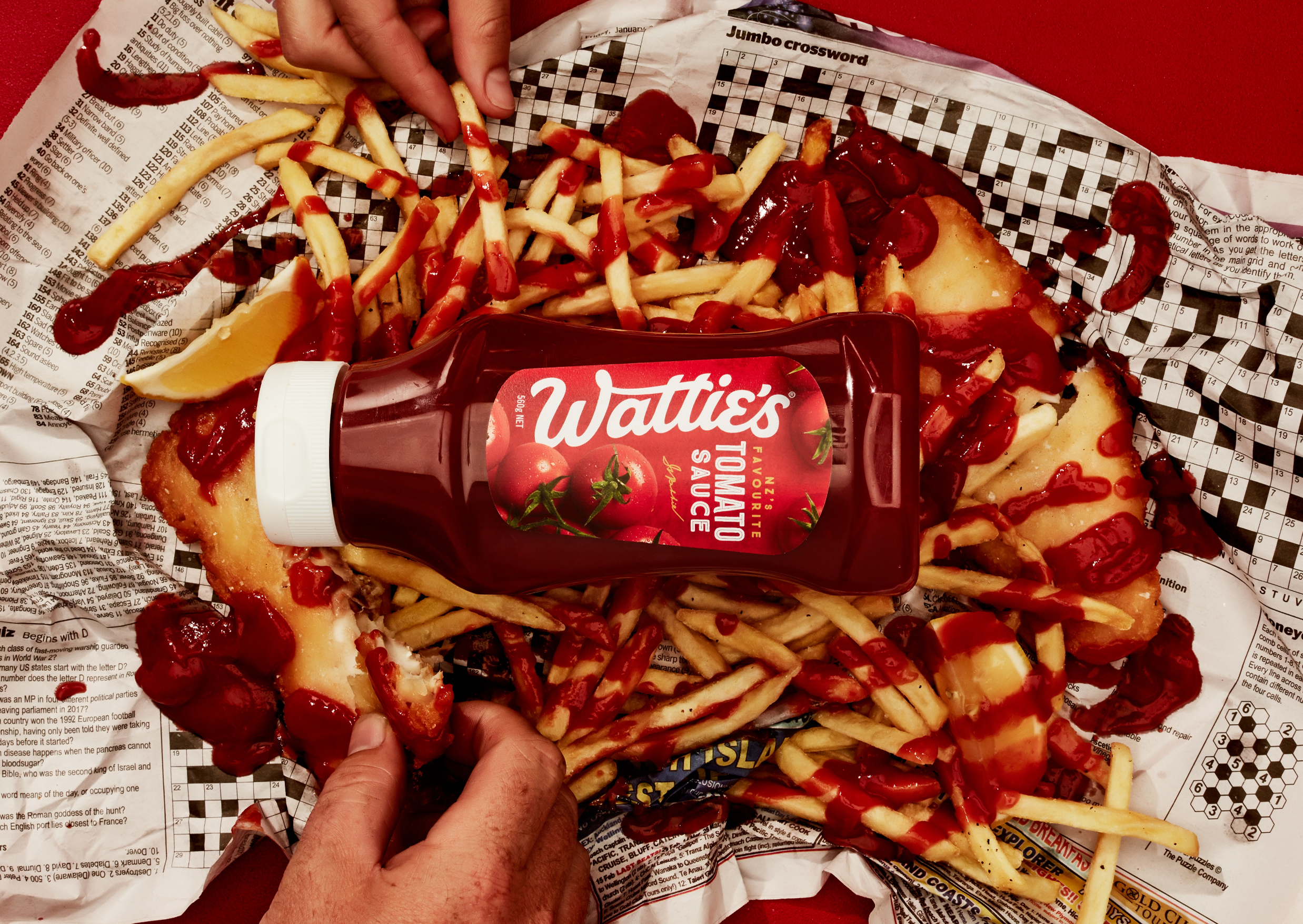
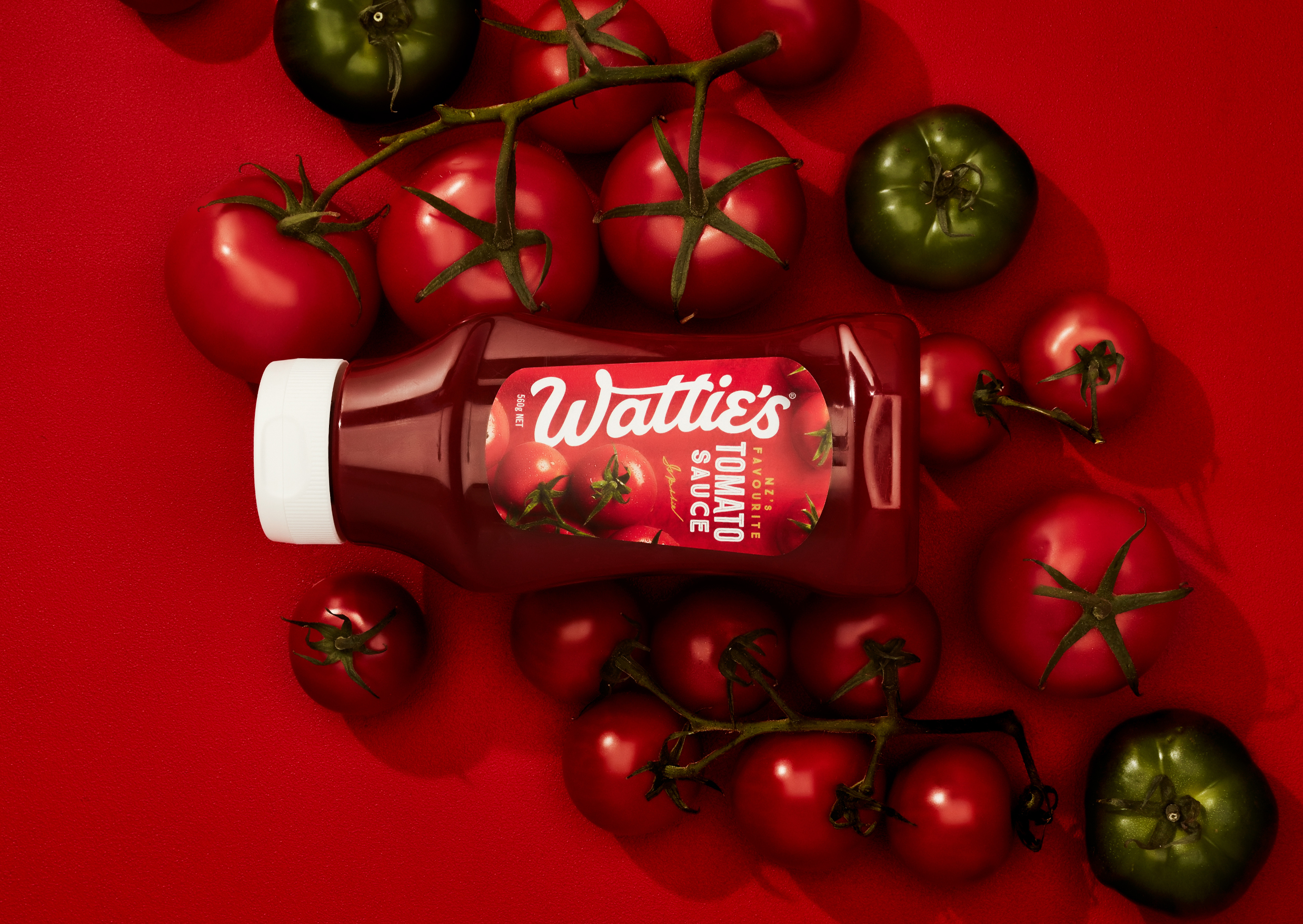
Wattie’s Tomato Sauce, one of the most iconic New Zealand family pantry staples, was the first range we redesigned. Our new unapologetically big and bold wordmark swept through the entire pack, creating a base for dramatic overhead shots of delicious tomatoes.
With the launch of Tomato Sauce range and reveal of the brand’s new look, we paved the way for to reinvigorate their entire brand visual language.
︎ Agency: Unified Brands
︎ Client Service & Strategy: Mike Robertson, Zelda Senekal
︎ Creative Team: Chiara Ronchi, Chris Redditt, Emma Lawrence
︎ Case Study Photography: Shadowlands, Kayla Jurlina
For 80 years Wattie’s had been bringing generations of Kiwis together to share and enjoy great food, however while the brand had always been held dearly by New Zealanders, it was starting to lose its relevance, hence Wattie’s came to Unified Brands for a big scale rebrand.
As the first project that I led as a Creative Director at Unified Brands, taking on such an iconic Kiwi band was a huge task that was both scary and extremely exciting.
It was no secret that Wattie’s had always been a family brand, but over time the entrepreneurial spirit of its founder, Sir James Watties, had been overlooked. To reinvigorate the brand, we set to treat Wattie’s as the dynamic, adventurous entrepreneur that Sir James had been.
We injected the life back into the wordmark by playing on the quirky personality of typographic accents that are so iconically Wattie’s, weaving a more natural flow and craft into it along the way. I like to describe it as finding the perfect meeting point between heritage and modernity – comfortable but intriguing!
Controversially, we have even turned the brand on its head, quite literally, introducing a vertical logo in Wattie’s portfolio - simple, bold and proud, almost as if signed by Sir J. Wattie’s himself.
Wattie’s Tomato Sauce, one of the most iconic New Zealand family pantry staples, was the first range we redesigned. Our new unapologetically big and bold wordmark swept through the entire pack, creating a base for dramatic overhead shots of delicious tomatoes.
With the launch of Tomato Sauce range and reveal of the brand’s new look, we paved the way for to reinvigorate their entire brand visual language.